
|
Scripps
College Press ~
California |
Share this page:
|
In 1986 Kitty Maryatt became the Director of the Scripps College Press and instituted a program of collaborative class books. |
|
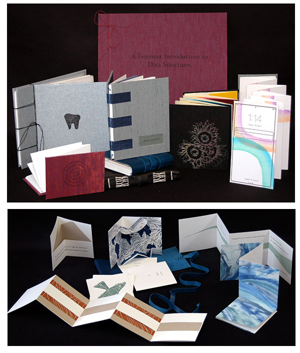
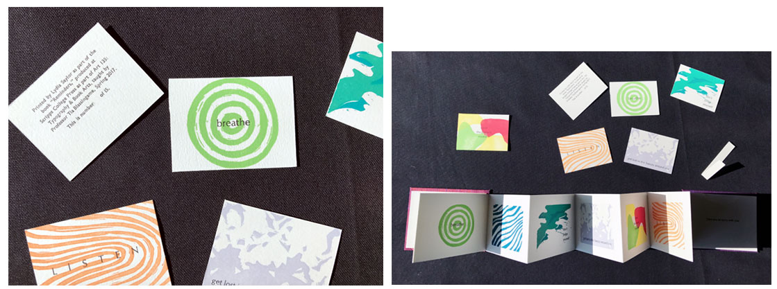
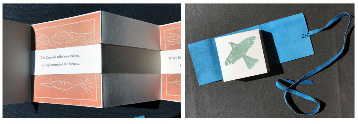
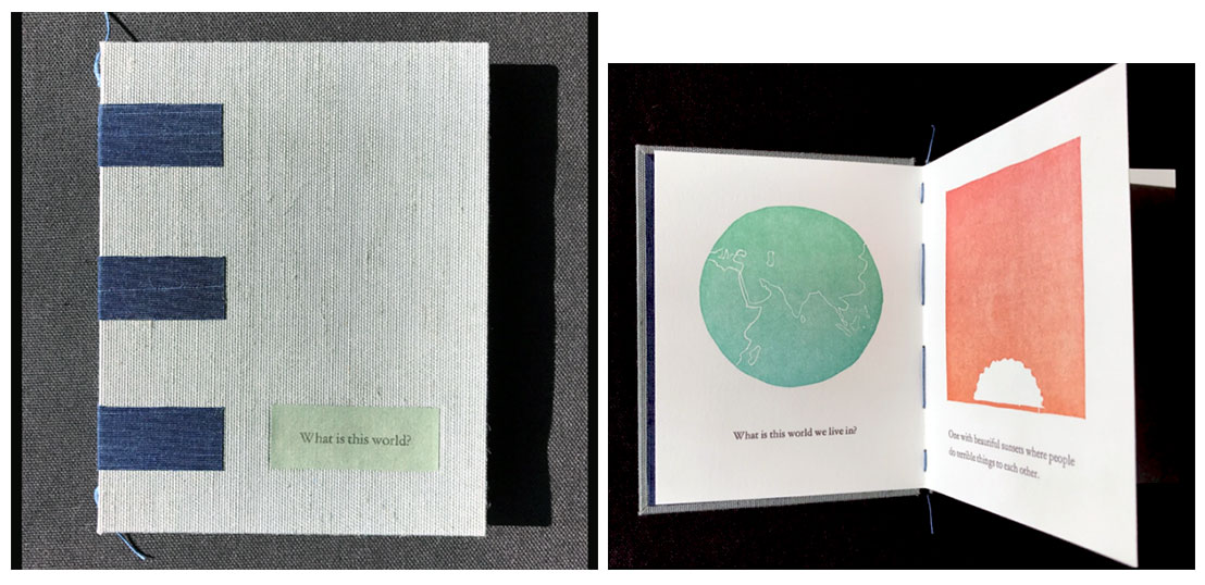
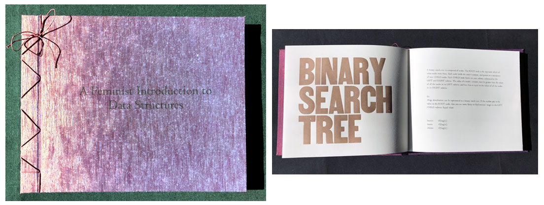
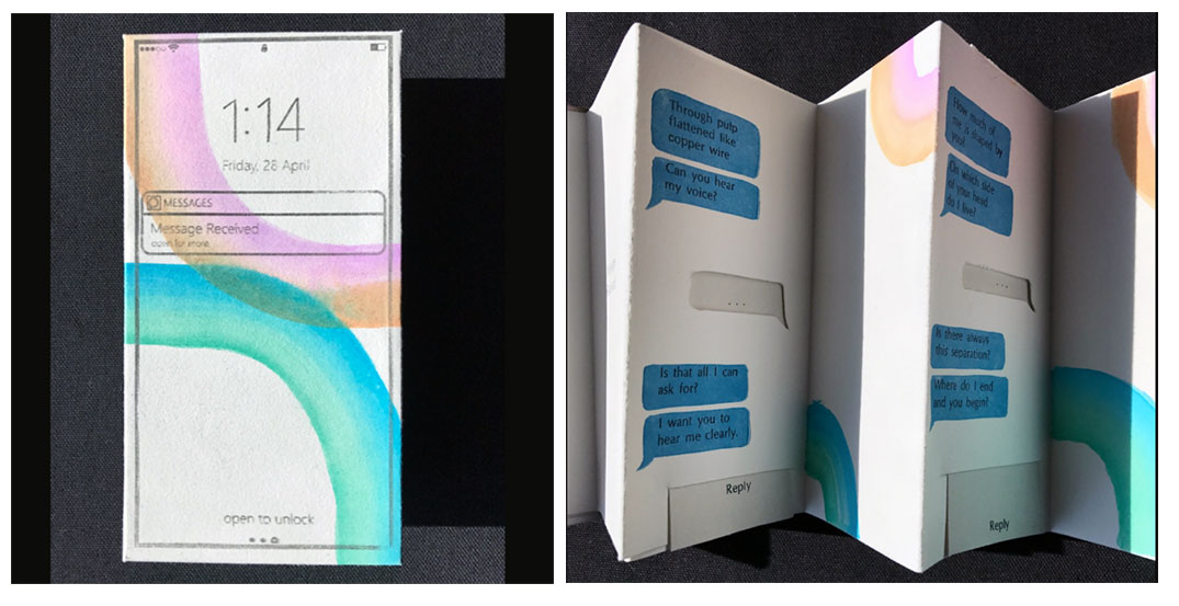
Scripps student books, spring 2017 Since 1986 the Scripps College Press has produced a collaborative book per semester created by their Typography and Book Arts Class. For the first time In the spring of 2017 each student produced her own book. Eight books were produced in an edition of 15. Each signed and numbered by the creator. Reminders by Lydia Saylor Fledged by Lauren Koenig Between the Lines by Anthony Perna What is this World? by Emily Scottgale A Feminist Introduction to Data Structures by Carmen Mejia Finding My Sunflowers by Gillian Chen Message Received by Devin Powell Tooth by Liat Kaplan
|
|
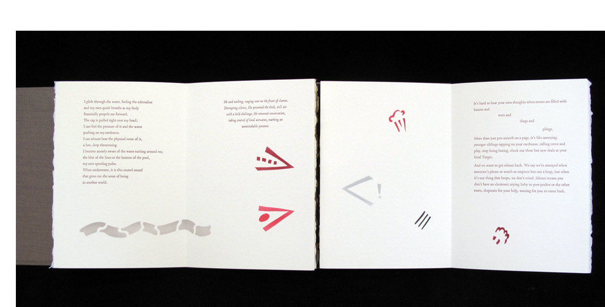
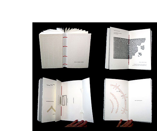
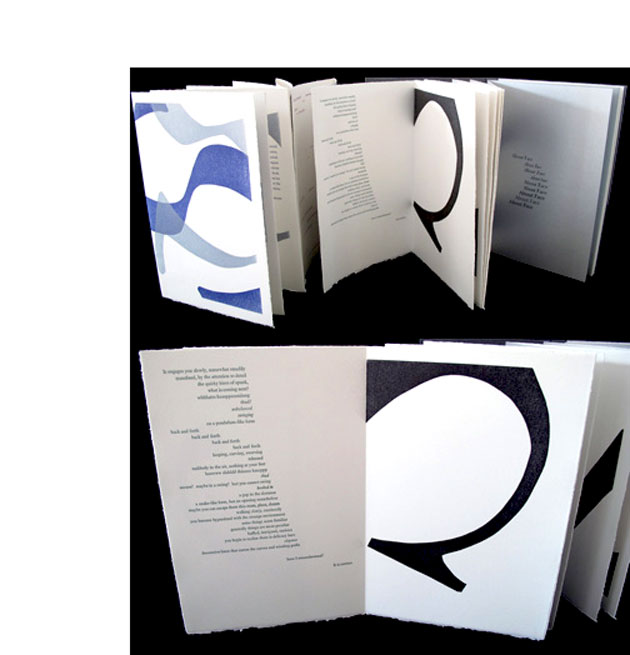
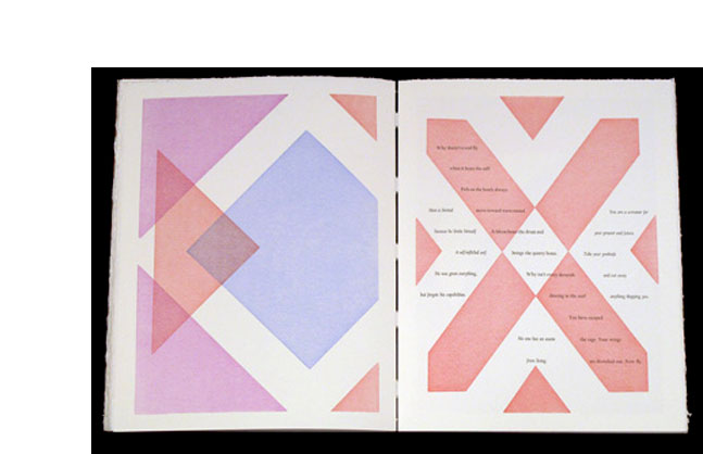
| Non Sense By Typography and the Book Arts Class at Scripps College Assisted by Prof. Kitty Maryatt Claremont, California: Scripps College Press, 2014. Edition of 101. 11.5 x 7.5"; two accordion books both extending from the back pastedown, one to the right and one to the left. Letterpress printed with 12 pt. Centaur and Arrighi typefaces on Rives BFK and Arches Cover. Imagery produced by cutting plastic Duralar stencils then coloring with Colorbox pigment pads. Bound in Japanese bookcloth over boards. Signed by participants. Numbered. Colophon: "Ten students at the Scripps College Press created, set metal type by hand, printed by letterpress, and hand bound this limited edition book on experiencing silence. Six colors of paper were chosen to suggest the way we might experience silence through the senses." Prof. Kitty Maryatt, Introduction: "The Humanities Institute at Scripps College provides lectures, films, exhibits and discussion groups every year on a rich and multi-faceted theme. The theme this year was silence. "We adopted this theme for the Scripps College Press book project in order to investigate how we experience silence through our senses. "Naturally, we discussed the fact that total silence is impossible to experience, since it only occurs in a vacuum. The students proceeded to tease out those aspects of silence that we can experience physically or metaphorically." $200 (Last Copy) |
 Click image to enlarge |
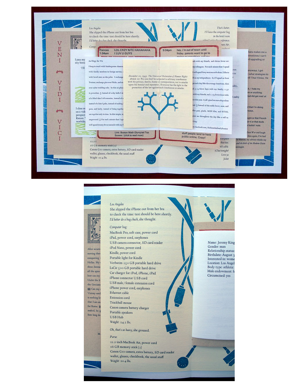
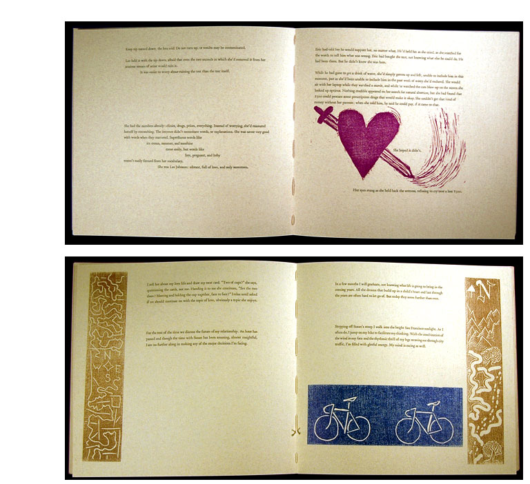
| Deluge By Students of Scripps College Press under the direction of Professor Kitty Maryatt Claremont, California: Scripps College Press, 2010. Edition of 103. 17.25 x 11.25"; 44 pages. Letterpress printed. Bound in cloth covered boards. Colophon: "The texts were presented on differing sizes of three papers, Nideggen, Frankfurt Creme, and Frankfurt White, reflect layering on the desktop of information from the internet. All the type was hand-set from metal typefaces, which included Scripps College Old Style, Optima, Centaur, Universe, Garamond, Caslon, Goudy Modern, Fournier, Weiss Initials, and Forum Capitals. The SML code on the title page was written as a computer science class assignment to encode/decode RSA encrypted messages; it was printed as a photopolymer plate. The printed colors are inspired by the RGB system, as might be seen on a computer. Imagery was carved into linoleum and printed on four Vandercook presses. The binding material, Quinel Graphite, was chosen to resemble the soft cases that protect laptops and iPads from damage." Kitty Maryatt, afterword: "The Typography Class was first asked to develop a list of one hundred significant problems in America, and subsequently organized them into seven categories. After extensive in-class discussion, they decided to select addiction to media for their advocacy efforts because it is continually in the news as a growing problem. They all have extensive experience with the deluge of information on the internet and the latest social networking tools like Facebook and Twitter, and even have friends who are on the verge of addiction. Their goal became not only to promote awareness of the consequences of addictive behavior, but also to reveal the lure of new media that seduces us daily." $240 (Last Copy) |
 Click image for more |
| Naked Faces By Students of Scripps College Press under the direction of Professor Kitty Maryatt Claremont, California: Scripps College Press, 2009. Edition of 95. 7.75 x 11.25 x .75"; 38 unnumbered pages. Accordion fold book extending from back pastedown with 12 page pamphlet bound in last fold. Printed on Rives BFK 150 gsm paper. Linoleum block images. Pamphlet: 12 pages, digitally printed on silver Stardream Text paper. Bound in Ginga bookcloth. Signed by students on back pastedown. Colophon: "Nine adventurous intellectuals embarked upon the journey of designing an artist book. Our goal was to construct a tome so powerful, so wondrously provocative that you would be overcome with emotion. In our creative journey, we have transformed luxurious materials into a glorious printed book with techniques that have been fervently taught at Scripps College for decades. We sullied our bare fingers with forest green, teal, electric blue and purple in the pursuit of our formidable goal. Our charmingly vintage Vandercook presses were our closest allies throughout the process." Scripps College Press: "Robert Bringhurst classifies type based on movements of the time period in which it first appeared. We looked at typefaces from that perspective, by listening to music and looking at artworks from the period. The myriad tiny details that make up a letterform have emotional impact on the entire typeface. Highlighting those rising emotions that are evident in the finished face became the focus of the book. Students selected digital typefaces from Bringhurst's classifications list to investigate but used the metal typefaces available at the Scripps College Press for the emotional descriptions. Weiss Initials were used for the titling and headings, while Scripps College Old Style was used for the front and back matter text. Various typefaces were used for the emotive texts. Colors of forest green, teal, electric blue and purple were used for the emotive type passages. The book was printed on Rives BFK with linoleum cut shapes printed in black. ... The binding structure is accordion-fold so you can stretch out the book and see the play of emotions. The boards are covered in silver Ginga bookcloth with images printed in blue." $150 (Last Copy) |
|
Scripps College Press Out of Print Titles: |
|
| Ad Libitum By Students of Scripps College under the direction of Professor Kitty Maryatt Claremont, California: Scripps College Press, 2012. Edition of 111. 6.25 x 6.25"; 34 pages. Typeface: Centaur 12 pt. Letterpress printed on Nideggen paper. Bi-fold binding in Japanese bookcloth. Exterior boards paper-covered. Colophon: "The text was first printed as a song cycle and then presented again as musically animated texts enlivened by graphic performance directions. The colorful graphics were hand-carved into linoleum, or drawn by hand and made into photopolymer printing plates. The dominant colors used are blues, reds, and browns. The song cycle was bound as a single signature, while the performative sections was bound as an accordion fold." Prof. Kitty Maryatt, Intro: "In Denison Library, we have several medieval music books. Among them is a large Gradual and a Pontifical in original wood boards. The music is hand-written in Gregorian chant notation with four red staff lines and nice fat diamond-shaped notes. From our music professor, Chuck Kamm, we learned to interpret the notation and sing some sequences from the Gradual. We brought Prof. Mary Kay Duggan from U.C. Berkeley to give the Frederic W. Goudy Lecture and Workshop on early music and engraving. However, the original impetus for this semester's book actually came from trying to understand John Cage's 1969 book, Notations, in which he collected experimental graphic notations for contemporary music. "The students were asked to create a song cycle based on songs that were important to them, using them as a device to capture strong memories. By looking further at Theresa Sauer's book, Notations 21, published in 2009, and other notational books, they developed graphic imagery as an aid to performing their song. We encourage you to read their song cycle aloud as a musical performance." (SOLD) |
 Click image for more |
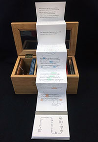
| Amongst the Shelves By Typography and the Book Arts Class at Scripps College. Assisted by Prof. Kitty Maryatt. Claremont, California: Scripps College Press, 2016. Edition of 105. 4 x 5 x 9" hinged wooden box with window in lid and three section base. In each section rest three 4 x 2.75" books. Printed on either Somerset Satin or Rives Heavy weight paper. Bound in bookcloth, leather, or paper. Signed by Prof. Maryatt. Numbered. Signed by each participant with short recap of their book in the colophon book. Scripps College Press: "For the last book edition overseen by Prof. Maryatt in the collaborative series started in 1986, we decided to examine the book as an icon. We looked at significant developments in 650 years of printing history using primary sources at Denison Library, including a Gutenberg leaf, and books printed by Aldus Manutius, Nicolas Jenson, John Baskerville, Giambattista Bodoni, Frederic Goudy and Sumner Stone. The result is a small library, housed in a bamboo tea caddy, showcasing the continuing importance of the book." In the colophon the student-bookmakers offer a few words explaining their contribution. (SOLD) |
|
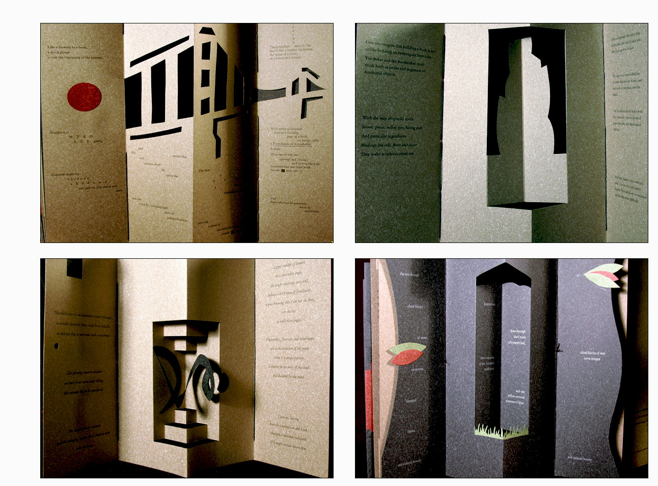
ARCH 15.75 x 4 x 2"; 64 unnumbered pages. Double sided accordion fold. Typefaces: Garamond, Ehrhardt, Fournier. Pop-ups and papercutting. Letterpress printed. In clear acrylic slipcase. Kitty Maryatt, introduction: "On January 7, 2010, just days before class was to start, the Los Angeles Times published a fascinating article on contemporary women architects, highlighting a striking building by Jeannie Gang. Earlier this year, the brand new President of Scripps College chose the Genius of Women as her inaugural theme. What serendipity! This gave us the perfect inspiration for our artist book: the genius of women architects. After extensive research and class discussion, a mission statement for the book evolved: Architecture, like books, is a delicate balancing act between stability and motion, interior and exterior, aesthetic values and structural practicalities. Books, like buildings, are fundamentally inhabited spaces. They are incomplete without human interaction. "The first portals were built of post and lintel construction. A curved arch is more difficult: the keystone is needed at the apex to lock the other pieces into position. Building a book is similarly difficult feat." Post-Inspection aka the Colophon: "This book was built by ten women paper architects. Their tools were knives and bone folders, and four Vandercook printing presses. They blended three typefaces chosen for their affinity and distinctiveness: Garamond, Ehrhardt, and Fournier.
Thus stated Maya Lin, noted architect, in her book, Boundaries. The students developed structural imagery using only paper by thinking with their hands. "Heather paper from Europe was selected for its natural stone-like colors of oatmeal, sage, charcoal, and mahogany. It was exactly the right stiffness for cut-aways and pop-ups. The tops of the rising sections were hand-cut to suggest a natural landscape where built structures fit into their environment, which changes as you manipulate the book into different configurations. You move from the outside to the inside, as if through openings." |
|
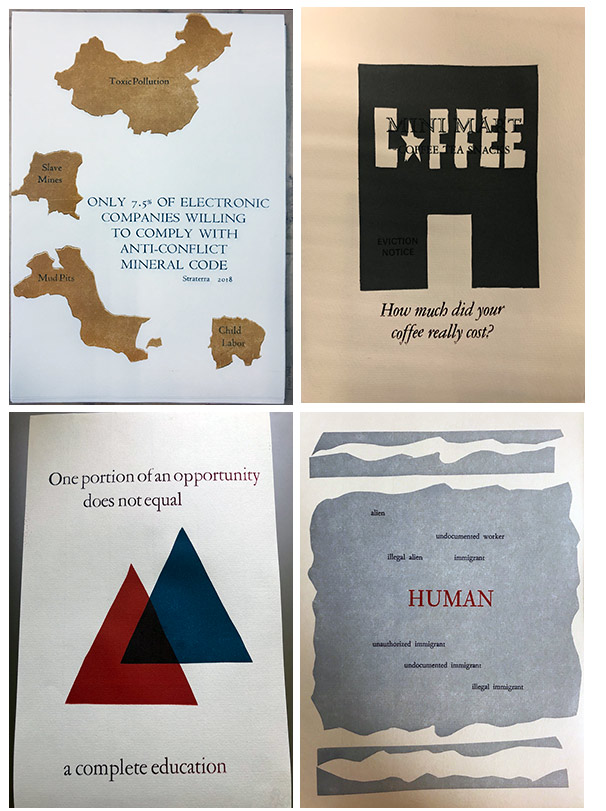
&: books arts & social justice 6 x 9"; 13 leaves. Linocuts, cut vinyl, handset letterpress of varied typefaces. Printed on Hahnemühle Ingres paper. In a white envelope with printed title on front. Artists names printed on back. Signed by each artist. Numbered. Each broad sheet signed and numbered. Scripps College Press: "In the Spring 2018 Book Arts & Social Justice seminar course taught by Professor Tia Blassingame at Scripps College, thirteen undergraduate students created letterpress prints on a variety of social justice topics including access to education, mental health, Syrian refugees, human and environmental exploitation. "Students documented their process and inspiration in textual and photographic entries on the class website. You can view the various activities of the class at their website. Students curated an exhibit of prints and artists' books, interviewed prominent and emerging artists working in the book form, and created this limited-edition, letterpress print portfolio exploring varied social justice issues. " |
 Click image for more |
Choix de Vivre 9.5 x 9"; 72 pages. 12 pt. Letterpress printed with centaur type on Nideggen paper. Linoleum and reduction block images. Exposed spine binding. Deep purple textured cloth (suggesting clouds and birds?) over board. Professor Kitty Maryatt, for the Introduction: "The process of producing a limited edition letterpress book involves extensive decision-making. What is the overarching idea of the book? Where do we get imagery? How does it relate to the text? What kind of techniques will we use? What is our budget? When is the publication party? These questions are addressed every semester at the Scripps College Press. Since such a plethora of choices is inherent to the book-making process, and indeed to everyday life, we thought that we might focus on the act of making a decision, explore possible consequences of those decisions and even evaluate decisions that are made for you. This led us to our title for this book about life's choices, a pun on joie de vivre." Text and images by six students. |
 Click image for more |
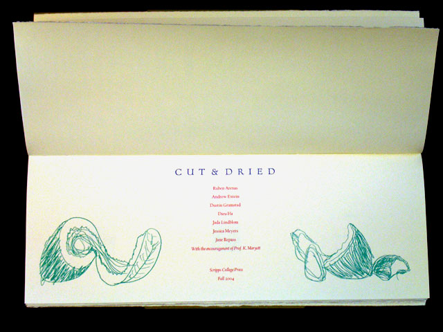
Cut & Dried 6 x 16.75" in avocado rind-colored cloth over boards. Printed on Frankfurt creme paper. Photographs by Andrew Extein, Dustin Gramstad, Jada Lindblom, and Kitty Maryatt were printed on an HP Indigo digital printer. Drawings printed from magnesium relief etchings. Woodcuts are carved from birch plywood blocks. A collaborative student work from Scripps College press under the direction of Kitty Maryatt. From the colophon: (SOLD) |
 Click image for more |
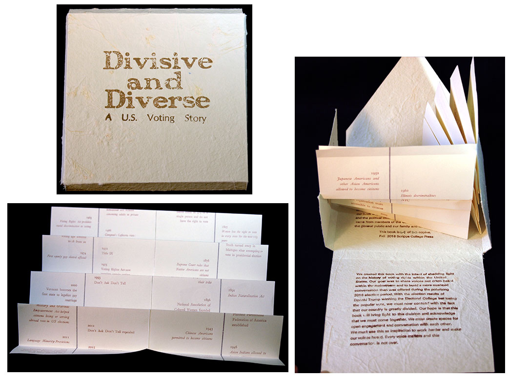
| Divisive and Diverse By Typography and the Book Arts Class at Scripps College Assisted by Tia Blassingame Claremont, California: Scripps College Press, 2016. Edition of 80. 6.25 x 6.25" fishbone-structure book laid in letterfold case. Letterpress printed with linoleum cuts on Rives lightweight paper and housed in a container made of a Langdell handmade paper. Metal type including Erhardt, Gill Sans, Fournier, Univers, and wood type were handset to create a timeline, colophon, list of student names, a candid letter to the reader from students, and quotes from the survey responses. Signed by the participants. Numbered. Scripps College Press: "Printed by six students using handset metal and wood type, this fishbone book examines identity and politics in the United States during one of the most contentious presidential elections in U.S. history. "Divisive and Diverse explores identity and politics through a gender lens during one of the most contentious presidential elections in United States history. A Spotify playlist accompanies the physical copy of the book. Quotes in the book were gathered from a student-generated survey about identity and the political climate. Responses came from members of the Claremont University Consortium, the general public, and family and friends." Colophon: "We created this book with the intent of shedding light on the history of voting rights with the United States. Our goal was to share voices not often heard within the mainstream and to build a more nuanced conversation than was offered during the polarizing 2016 election period. With the election results of Donald Trump winning the Electoral College but losing the popular vote, we must now contend with the fact that our country is greatly divided. Our hope is that this book will bring light to this division and acknowledge that we must come together. We must create spaces for open engagement and conversation with each other. We must use this as inspiration to work harder and make our voices heard. Every voice matters and this conversation is not over." An order of Divisive and Diverse includes "Protest through Music," a Spotify playlist created by the books authors. (SOLD) |
|
Dorothy Drake and the Scripps College Press 6.5 x 9.5”; 35 printed pages. Handset in Scripps College Old Style. Printed on Frankfurt crème paper. Case binding features a patterned Japanese cloth. Housed in a two-color slipcase. Frontispiece by Bertha Goudy, letters from Frederic Goudy to Dorothy Drake, and drawings of the Scripps College Old Style type. Denison Librarian Judy Harvey Sahak was asked to lecture at the 50th Birthday Party of the Scripps College Press about the beginnings of the Scripps College Press in 1941. The Scripps students in the typography class acted as editors, typesetters and printers to commemorate the event. This book has the first showing of the Scripps Italic type designed by Goudy in 1945-6. |
|
| EMERGE By Students of Scripps College under the direction of Professor Kitty Maryatt Claremont, California: Scripps College Press, 2013. Edition of 111. 11 x 5.5"; 44 pages. Somerset Satin text paper with hand-copied drawings. Simple paper binding. Numbered on the colophon. Signed by the participants. Colophon: "This is the 54th edition in our collaborative book series in the Typography and the Book Arts class. Most of the elements in this book were not printed, which is unusual for our semester book project. All the drawings were hand-copied from the students' original master drawings using light tables. The students drew with a Uniball Signo .38 pen. The colorizing was by pochoir using Duralar hand-cut stencils and Color Box pigment pads. The text type is 12 pt. Centaur and Arrighi, small and delicate. We chose Somerset Satin as the text paper because it takes drawings so well. The simple paper binding utilizes Arches Cover Black. The cover image was drawn with a white pen." Foreword: "The relationships between the four dimensions: line, area, volume and time, were the focus of this class. We started by drawing from nature, drawing only the edges of leaves and flowers in a continuous line, in order to explore the boundary. Next we allowed lines to intersect, creating areas, which demanded to be filled with color. This led us to choose colors which followed the seasons, starting with winter. To depict volume, we overlapped and lifted images off the page. The time element was reflected in the changing of the seasons, as well as the time it took to produce the original drawings and getting each process done in a timely fashion. The sparse text was developed after the images were finalized. In the end, we wanted the images to be just out of reach of recognition." (SOLD/Out of print) |
 Click image for more |
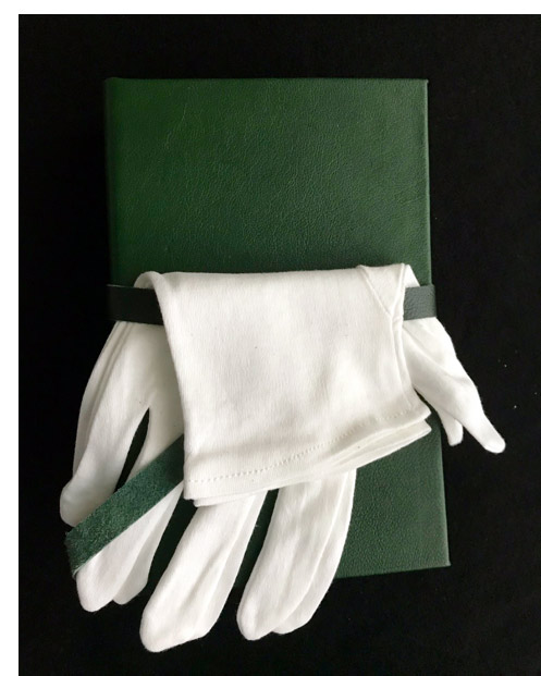
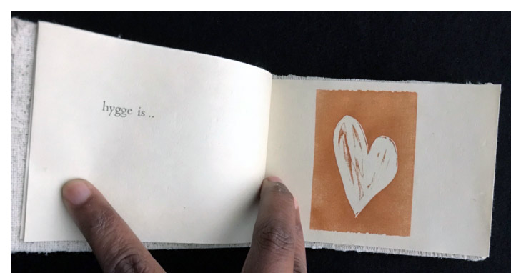
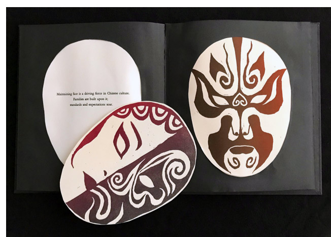
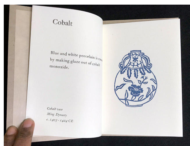
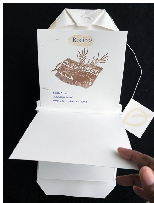
Fall 2017 Student Artists’ Books Scripps College Press: "This semester Scripps, Harvey Mudd, and Pomona students created limited-edition letterpress artists’ books. These students represent the following majors: Art, Art Conservation/Art History, Computer Science, Economics, Engineering, English., and Public Policy. The subject matter covered in their books is as wide ranging as their disciplines. This group of student artists’ books includes an encyclopedic survey of pigments, discussion of the Los Angeles water system, a portrait of world teas, and the concept of 'face' in Chinese culture. As last semester [Spring 2017], each artist’s book represents the effort and vision of an individual student. Edition sizes range from twelve to fifteen copies." Please Touch by Zora E. Martin 5 x 8"; 14 pages. Pages form 6 paper pockets opening at foredges. Materials: rabbit fur, gold leaf, sandpaper, birch bark, pebbles, silk. Blind embossed text. Bound in green goatskin leather with matching leather belt closure. Includes white gloves. Flows by Duncan Crowley 9.5 8". 10 pages. Letterpress printed on BFK Rives cotton paper. Text set in 18 pt. Scripps College Old Style typeface with numbers set in Garamond. Accordion fold. PVC pipe binding. Book slips out of binding for display. Finding Hygge by Ishbel McCann 3.5 x 5.5; 18 pages". Letterpress printed on kitakata paper. Linocut sketches. Stab bound. Padded cover. Includes vial of fragrance bound to spine. Changing Face/Saving Face by Josephine Ren 8 x 9" closed. Letterpress. Linocut masks. Rives BFK and laser cut Hahnemühle Ingres paper. Accordion fold book. Designed, printed, and bound by Josephine Ren. Pigments by Milena Carothers 5.5 x 7"; 24 pages. Lino cuts. Letterpress text in Caslon Oldstyle. Printed on Rives lightweight paper. Stab binding with paper covered boards. Loose Leaf by Morgan Carothers 7 x 8.5"; 20 pages (one side printed, back side blank). Letterpress printed on Rives BFK paper with tea stained rice paper pages. Flag book structure. Cover designed to resemble tea bag with folded foreedges. Front cover slips into the folded foreedges. Colophon attached by string to folded foreedge. Monstrosity by Savannah Mellberg 4.25 x 4.25"(closed) double-sided accordion fold with two sewn pamphlets. Letterpress text. Cut vinyl and linocut images. Printed on a mix of Rives BFK, lokta, and Ingres papers. Bound in cloth boards. In net bag with ribbon closure. Colophon printed on the bag. |
Click individual image for more or enlarge
|
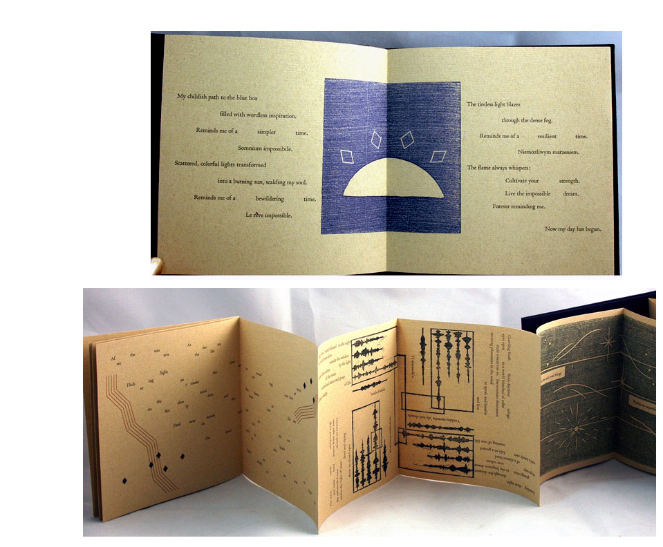
| flecks of light By Typography and the Book Arts Class at Scripps College Assisted by Prof. Kitty Maryatt Claremont, California: Scripps College Press, 2015. Edition of 92. 3.5 x 3.5" closed. 9 origami folds. Double-sided. Printed in 12 pt. Goudy Modern on Mohawk Superfine Cover. Linoleum cut images brushed with acrylic gel medium. Folded pages glued. Museum board covers with ribbon and magnet closure. Numbered. Kitty Maryatt, Director of the Press: "The students did research on medieval pigments, because the names of the pigments are so evocative, and the process of making the pigments so onerous. I brought in books on the history of color, including color encyclopedias. We asked our painting professor to give a talk about how painters decide on colors in painting, especially when the images are abstract. We looked at books on Turner, Rothko, Sonia Delaunay, Malevich, and Diebenkorn. Next we looked at the difficulties of color printing, especially interesting since the students are so used to digital printers which so easily print in color. "After long discussions and the making of several models, the students decided on their color palette: the rainbow. They were inspired by an origami-folded book and decided to choose that structure. They started printing colors on Mohawk Superfine cover paper and worked on the designs and texts for their own pages. Many of the pages had two and three, and even four press runs on one side. They used jigs to fold the paper, so that the paper could be scored first before folding in half, in half again, and on the diagonal. The gluing process had the dangerous potential of gluing together parts upside down, so we worked on gluing all of two parts together first, then four parts together, and so on. "The book springs open, and so the magnets hold the pages together until you want to open it. The magnets are useful for when you want to hang the book for display: put a loop of string up high, and then just place the two magnets together around the string. It turns slowly in the breeze so that you can see both sides. When you close up the book, make sure the magnets are situated at the edge of the books so you don't get a dent in the cover. The ribbon slides so that you can do this." (SOLD) |
|
| Good Data / Bad Data By he Typography and the Book Arts Class at Scripps College. Assisted by Prof. Kitty Maryatt. Claremont, California: Scripps College Press, 2014. Edition of 102. 6.75 x 10"; 86 pages with one foldout page and one pull-down page. Printed by four Vandercook presses on Rives Heavyweight paper, Softwhite in 12 pt. Gill Sans. Linoleum cut images. Bound in cloth-covered Davey boards attached by the tapes to the ten sewn signatures. Signed and numbered. Prof. Kitty Maryatt, Scope of Work: "For the last three years, articles on big data have been appearing almost daily in the newspapers. The collection and use of such data has both positive and negative aspects, particularly in the area of personal privacy. This topic therefore seemed like a good candidate for investigations by the students in the Typography and the Book Arts class. The visual presentation of data has been widely discussed by many in the emerging information design field, by Yale computer scientist Edward Tufte in his four books, and by various authors on visual complexity. Five areas of book design were first investigated: the choice and use of type, layout of double-page spreads, coordination of image and text (especially presentation of data), title page layout, and book structure. After researching these areas, students chose to present their reactions to big data sets, both good data and bad data." (SOLD) |
 |
Habitué 5 x 5" closed; 94 pages. Colophon: "The paths were constructed from five-ply vinyl glued to MDF boards, while reverse paths were carved from linoleum. Both were printed letterpress on Vandercook presses. Further imagery was carved into linoleum. Some blocks were overprinted while others were suicide blocks. The accordion-folded book is bound in a case with lime green cloth glued onto Davey board with recessed paths." Produced by the Fall 2007 Class of Typography and the Book Arts led by Kitty Maryatt, Director of Scripps College Press. Each of the 10 students (Donielle Kaufman, Maia Ashkenazi-Cnaany, Paige Pauli, Sara Kendall, Samantha Morales, Mina Hoffman, Alexis Ding, Elizabeth Balch, Michele Murphy, and Yoshie Sakai) wrote a piece about a part of her life in which repetition, regularly repeated actions, held sway. |
 Click image for more |
KØTØBÅ NØ PÅRTY 5.25 x 6.5". Printed letterpress. Images carved into linoleum or stenciled by pochoir. Printed onto Somerset Book paper. Each sheet French folded and organized into paper folders which slip into a case with an unusual accordion fold at the opening spine. The case utilizes Tyvek mounted to Somerset Book. Case blind embossed. Kitty Maryatt: "This is the 42nd in the series of limited edition collaborative books made at the Scripps College Press since 1986.... "For the 65th Anniversary of the founding of the Scripps College Press, a day-long symposium investigating the origins of the book arts movement in the 20th century was presented in January of 2007. "The theory that the poem 'Un Coup de dés,' published in 1896 by French symbolist poet Mallarmé, instigated much of the activity was imaginatively discussed by Betty Bright, Johanna Drucker, Judd Hubert,Clifton Meador and Marjorie Perloff. "In order to investigate these theories further, students in the Typography and the Book Arts class were asked to consider zaum poetry as developed by Russian avant-garde artists such as Iliazd from 1913 onward. Zaum poetry has been described variously as performative music-language, untranslatable sound beyond signification, enhanced meaning or meaning turned inside out, Cubo-Futurist indeterminacy with symmetry and pattern, rhythm and harmony, color and sound. "Students looked particularly at the book Poésie de Mots Inconnus published by Iliazd in 1968 for inspiration in language use, text/ image balance, typographical and book structure. Original texts were written by the students in eight languages.... The title, KØTØBÅ NØ PÅRTY, means word party in Japanese." |
|
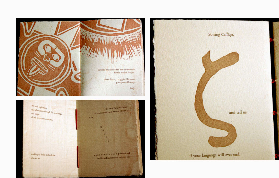
| Manuscript By Students of Scripps College Press under the direction of Professor Kitty Maryatt Claremont, California: Scripps College Press, 2011. Edition of 95. 5.5 x 4.25 x 1.5"; 92 pages. Hand-set 12 pt. Centaur and Arrighi types. Letterpress printed on Arches Cover paper. Linocuts of glyphs. Pochoir highlights. Bound in oak boards. Prof. Kitty Maryatt, Introduction: "Writing systems develop from a need to communicate practical information, historical accounts, tales, and myths. They vary in structure: syllabic, alphabetic, pictographic. Some disappeared with an extinguished culture, never to be deciphered, and some were decoded to great excitement and acclaim. Those who could write, the scribes, frequently claimed high status in their society. The writing tool and substrate are intimately connected to the style of the language that arose. The look of the system can be artistically changed by choosing a new material with which to write the language: linoleum, a brush instead of a stylus, cutting with scissors. The meaning of the glyphs, words and phrases still retain their power, no matter what tool is used to represent their significance." Colophon: "Boards were covered with papyrus, fabric, leather, and silk-laden papers for printing as substrate textures. Glyphs were carved into linoleum representing characters, words and phrases. ... The book was printed four-up and cut and folded to form signatures which were sewn together through quarter-sawn oak covers, evoking books still made up through the 19th century in Ethiopia." (SOLD) |
 Click image for more |
On the Impact of Expectations Housed in 6 x 6.25 x 2.5” pearlescent box. Letterpress from various typefaces. Illustrated with linoleum blocks, pochoir, and polymer plates. Six bound and unbound booklets include sewn, accordion, dos-à-dos, and puzzle piece constructions. Each 5 x 5-inch booklet is slipped neatly into specially designed "file folders" made from Rives Heavyweight paper (tan) and painted with pearlescent paint. The names of the authors/book artists are neatly arranged in plastic tabs at the top like files. Lifting the cover off the acrylic box and seeing the array of names, one may recall a recipe box, but that is only a trick of expectation. In the course of overseeing the production of thirty books in fifteen years of teaching typography at Scripps, Professor Kitty Maryatt has "observed that students often write overly predictable first rough drafts. As a result, the specific focus of this book is unpredictability or surprise." The resulting artist book is evidence of an experiment conducted by six students under her guidance. Their working hypothesis was that expectations can be undermined. The stories, written for the edition, challenge reader expectations in both their content and their form. Varied page configurations serve to reveal the structure of each story.. Unpredictable stories feature a character that diligently avoids the rain, a mathematical bisexual, a puzzle in a pouch, and the dark and light sides of charm. |
|
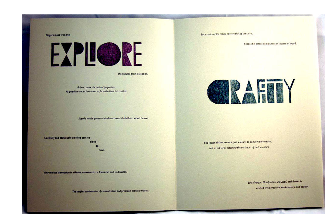
| Out of Sorts By Students of Scripps College Press under the direction of Professor Kitty Maryatt Claremont, California: Scripps College Press, 2012. Edition of 103. 9.25 x 12.25"; 14 pages. Accordion fold. Letterpress printed on four Vandercook presses. Wood and metal types. 12 pt. Gill Sans metal type. Printed on Rives BFK. Housed in plexiglass slipcase. Prof. Kitty Maryatt, Introduction: "After students researched type manufacturing history, it seemed reasonable to ask them this semester to design and carve their own moveable type in cherry wood. To keep it simple and direct, two prints made by lettering artist Hans Schmidt in the 70s were brought in as models for a highly geometric typeface. The proportions were modified to reflect the eight width grouping of the Trajan Column capital in Rome. Letters not in Schmidt's prints needed to be designed. Carving commenced and continued throughout the semester as new letters were needed for the book. We often found ourselves out of sorts. We purchased Fontographer so that a sub group of four students could digitize the type from the drawn and carved forms. A variety of experiments with the type could now be made into plates for printing. The experience of designing a typeface and manufacturing it in class proved time-consuming, painstaking, exhilarating, and ultimately rewarding." Wood type was carved into cherry and digitized by the students, who named it NeoSchmidt, after the lettering artist Hans Schmidt, whose prints they studied. To develop the content, the students wrote short paragraphs based on their experience with the process of designing and producing their font. Each student had a page to highlight some of the text they had written. (SOLD) |
 Click image for more |
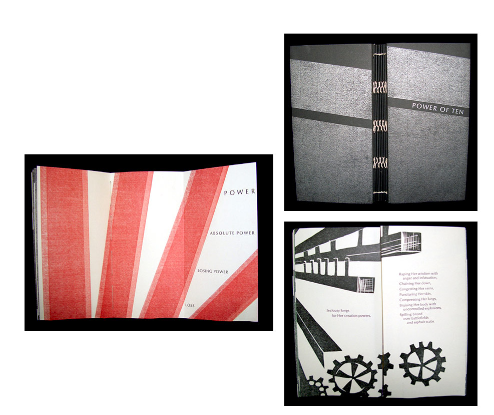
| Power of Ten By Students of Scripps College under the direction of Professor Kitty Maryatt Claremont, California: Scripps College Press, 2006. Edition of 100. 4.25 x 8.5"; 92 pages plus fold outs. Typeset by hand in 12 pt. Optima type. Printed on four Vandercook presses onto Mohawk Superfine, Soft White 80 lb. cover, with a smooth finish. Images printed from linoleum blocks; acrylic gel medium occasionally added texture. Signatures sewn together over a protective accordion fold paper. Bound in folded paper covers with printed image. Numbered. Signed by the participants. Scripps College Press: "This book is about locating the power in imagery and taking full advantage of the power of words. Students brought in examples of powerful images, identified visual power attributes, abstracted the image, and the developed their own images for the book. Lists of power words were generated simultaneously. As the images emerged, text was created to enhance the power of the image." (SOLD) |
 Click image for more |
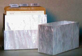
| Power Trip By Typography and the Book Arts Class at Scripps College Assisted by Prof. Kitty Maryatt Claremont, California: Scripps College Press, 2015. Edition of 102. 6.75 x 8"; 10 sections sewn into accordion folds with metallic thread. Centaur and Arrighi type. Letterpress printed on four Vandercook presses. Linoleum and Buttercut images. Bound in aluminum covers. Numbered. Introduction, "The Pitch": "Everyone has love/hate experiences with automobiles, especially in sprawling Los Angeles. Since the students who created this edition are from many parts of the world, they decided to share their perspectives on the advantages and disadvantages of owning, driving, crashing, modifying, and caring for cars, both old and brand new. They drew upon the materiality and physicality of vehicles for inspiration." Colophon, "Closing": "In our Goudy Workshop on papermaking for this semester, we had used 45 mil Buttercut sandblasting rubber for making watermarks. We decided to try it out for imagery as an alternative to our usual linoleum. The images cut from Buttercut were glued onto MDF bases. To seal the material, it was brushed with acrylic gel medium. Some images were also carved with linoleum cutting tools. Metallic inks were employed for the colors of the images. "Since automobiles are mostly made of metal, luscious metallic colors in the extensive Stardream line were chosen for the paper. The .040 inch aluminum covers were cut by Industrial Metal Supply and decoratively finished by Bud's Metal Polishing. The students softened the edges with a delicate final sanding." (SOLD/Out of Print) |
 Click image for more |
| Rock : Paper : Book By Students of Scripps College under the direction of Professor Kitty Maryatt. Claremont, California: Scripps College Press, 2013. Edition of 105. 5.5 x 9.5"; 94 leaves plus end pages. Texts and images printed on Rives Heavyweight using four Vandercook presses. Each section was wrapped with Rives BFK gray. Images were hand-cut into linoleum, or paper itself was added to act as an image. Bound in stiff paper wraps with a Coptic-style sewing pattern. Signed and numbered. Kitty Maryatt, announcement: "Rock : Paper : Book [was] created by fourteen students in the Fall 2013 Typography and the Book Arts class. We were influenced by Elizabeth Eisenstein's substantial two-volume study The Printing Press as an Agent of Change. "The students researched how paper has been an agent of change for over two thousand years. They made paper with the assistance of our former Typography student Colin Browne, and then embarked on writing texts on the subject of paper and ideas. Meaningful bits of their handmade paper are presented at the beginning of each student's section. " ... Colin Browne taught both Eastern and Western techniques and many different fibers, including cotton, abaca and kozo. In 1988, we were fortunate to purchase a used Hollander beater and hydraulic press, both built by Howard Clark several years before. "A Coptic binding style was chosen to reflect early binding techniques. The signatures do slip around as you open and move through the book, so once you are finished with your viewing, you can knock up the book at the head and then the spine on a table, and it will move back into its original shape." (SOLD) |
 Click image to enlarge |
Ruminations 11.25 x 14.25"; 36 pages. Letterpress printed. Set in Scripps College Old Style, Centaur, Arrighi, and Weiss Initials. Printed on Rives BFK paper. Signatures sewn over Tyvek reinforced tapes with gold thread. Bound in Ginga Iridescent Orange bookcloth. Colophon: "Inspired by our medieval books in Denison Library. Students chose to write commentaries, like the medievals, on an important text, a 14th century poem by the Persian poet Rumi: An Understanding of the Question. Geometric images suggested by the structures of medieval imagery were printed in medieval colors of minimum red, lapis blue, and royal purple." Scripps College Press: "Since Denison Library at Scripps College and Honnold Library at the Claremont Colleges have significant collections of medieval books, many still in their original bindings, the assignment to study these rare books was the focus of the Typography and the Book Arts class at the Scripps College Press. For the semester book project for undergraduates, the students selected eight books from the 14th to the 15th centuries at Denison for in-depth research into which medieval attributes persist in contemporary artist books. The books presented a range of subjects from Cicero and a law text to graduals, pontificals, and books of hours. The students made PowerPoint presentations to each other on the books they studied, highlighting not only physical characteristics but also translation of a short section of the book. "In addition to the obvious physical characteristics in medieval books: vellum, leather over wood boards, calligraphy, illumination, and miniatures, the students remarked that the texts that were hand-calligraphed were serious and of vital importance to the makers. In that vein, they decided to search for texts that were important to them to present in their book. Twelve students brought in twelve texts for consideration: poems and excerpts from novels, a family letter found after a fire burned down their house, a job acceptance letter, texts projected into space via the Voyager project, Harry Potter novels. After extensive discussion, the students winnowed down those twelve texts to the final selection of a poem from a 13th century Persian poet, Rumi. As did the medievals, they wrote commentaries on this evocative text, which was interpreted by Coleman Barks, who generously gave us permission to use his poem. The text was presented anew by each student in their section, either the entire poem or a selection, arranging the text and commentary within a structure. "The visual aspects of the book were inspired by the geometric structures of medieval book imagery, which included rectangular storyboarding and non-rectangular narrative structures. The colors of the linoleum blocks reflect the preponderance of lapis lazuli blue, crimson red, and royal purple in medieval miniatures. They were printed lightly in order to read the text printed on top. The Ginga Iridescent Orange bookcloth used for the binding introduces gold, which was quite prevalent in medieval manuscripts." |
|
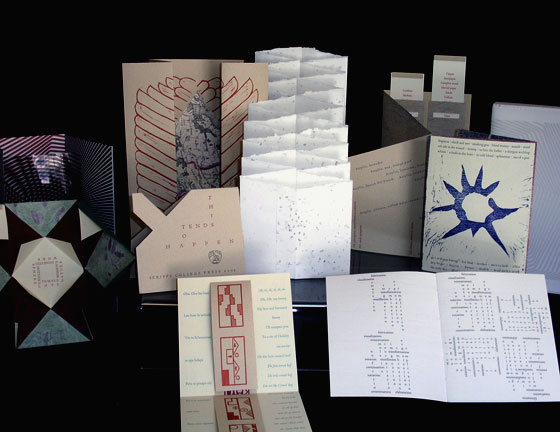
This Tends to Happen 5.5 x 10.75" in a hand-sewn double accordian-fold binding. Printed from hand-carved linoleum blocks and magnesium relief engravings. Printed on Frankfurt Cream, Frankfurt White, Nideggen, and multi-colored Thai paper. Font: Twelve point Centaur. Kitty Maryatt: "Scripps First Year students are required to read William Gibson's science fiction novel "Pattern Recognition" as a preparation to discuss postmodernism. Gibson asserts that everything is pattern recognition. In this vein, students in the Typography and the Book Arts class decided how they would define patterns. They wrote texts with the idea of presenting text as image, inspired by Iliazd, and image as readable text. In the process, they gave meaning to their pattern making." |
 Click image for more |
To One's Taste 6.5 x 9.5"; 116 pages. Handset from a selection of five typefaces and printed on Vandercook press. Paper: Japanese Yatso. Linoleum block prints. Cloth bound reminiscent of a traveling journal with bone and ribbon closure. Kitty Maryatt, Introduction: "The word spice conjures up a host of associations: fragrant, savory, pungent and aromatic. We think of favorite dishes spiced to our taste. One wants to research the fascinating 2000-year history of trade in silks and spices over the land-based Silk Road and the water-based Spice Route. How are the spices carried along these routes? What kind of people were the traders, and how hard were their lives when moving across deserts, snow-capped mountains and over difficult seas with basic navigation tools? The evocative aroma of a particular spice brings strong memories. This pot-pourri of thought and sensation was gathered together to create a tasty book by the now well-seasoned students at the Scripps College Press." |
 Click image for more |
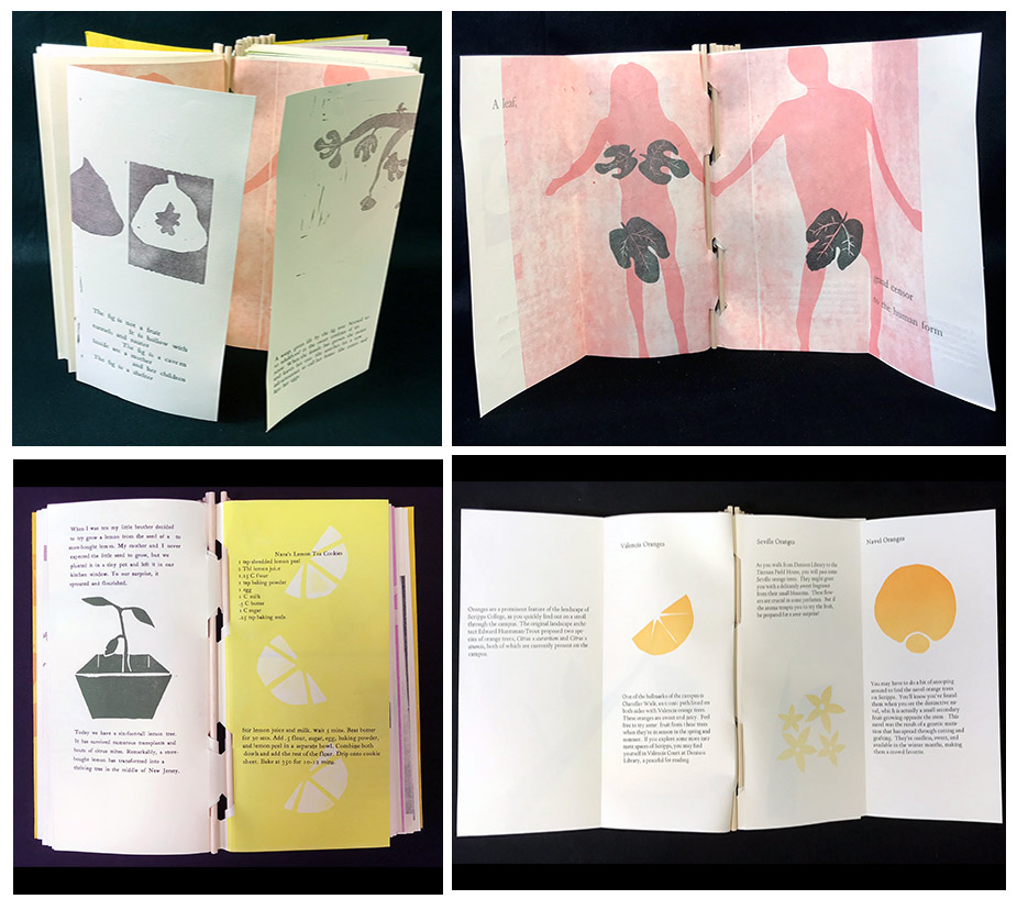
Toot Toot!: A Book About Fruit 4.5 x 9.75"; 12 sections. Each section in accordion format. Piano hinge binding. Letterpress printed using Scripps College Old Style and a selection of typefaces. Linoleum, cut vinyl, and pressure prints. Printed on Rives Lightweight and Langell handmade paper with Calendula petal inclusions. Signed by the students. Numbered. Scripps College Press: "Scripps and Harvey Mudd students worked collaboratively to create 'Toot Toot! A Book about Fruit', a limited-edition, letterpress book. Throughout the semester, Professor Tia Blassingame's Typography & Book Arts class viewed botanical illustrations, contemporary and archival documents at the Denison, Honnold, and Santa Ana Botanical Garden libraries in Claremont, California. Students viewed fruit crate labels, landscape maps of the campus and region, agricultural journals, historic photographs and postcards, and ephemera related to the fruit trees that appear in the book and on the Scripps College campus. The class took a campus landscaping tour led by the head of the Grounds Department. Students had opportunities throughout the semester to sketch, photograph, and pick the fruit trees. "Through class discussions, students determined the subject matter that would be covered in their section. Topics range from fruit pollinators to human labor, water usage, popular culture, and the use of fruit to market California. ... 'Toot Toot!: A Book about Fruit' features fruit facts, historical information, personal stories and memories. It may have started by looking at the fruit trees on the Scripps College campus, but it presents information pertinent to the Southern California region and state in general as it grapples with life after a drought - if such even exists - and the nation experiencing global warming, climate extremes, and what that means for the availability of fresh fruit." Introduction: "The ... class chose to focus on the role of ten fruit trees in marketing, tourism, cuisine, labor, and popular culture. Though each student had a different approach, all highlighted their fruit's importance and contribution to the Scripps' landscape or history. Students shared memories of fruit trees on campus, including the vivid smell of orange blossoms, snacking on fruit, and the communal aspect of landscaping. Students remembered first stepping on the campus and noticing the separation between the outside world and the lush, surreal Scripps grounds." |
|
Word 6.5 x 9.75 x 1"; 154 pages. Letterpress on four Vandercook presses. Typeface: Gill Sans. Imagery from type cases. Exterior: copper-colored thread sewn over Tyvek reinforced tapes attached to the black Japanese bookcloth cover. Colophon: "Imagery emerged directly from the type cases rather than from our usual linoleum blocks. The evocative leaf between sections was chosen for its translucency and colorful visual qualities. It was made in the Philippines from finely spun fibers." Introduction: "Peter Mark Roget wrote his first list of synonyms in 1805 for himself as an aid to more lively writing & lecturing. After a lifetime as a biologist interested in classification systems, Roget expanded his rudimentary list starting in 1848. He attempted to organize all thought into classes: abstract relations, space, matter, intellect, volition, & affections. Roget's Thesaurus was finally published in 1852. His original strategy was for readers to search for useful words through related ideas within the classification system. Most people who use the thesaurus don't know about this aspect of its use, so we thought it would be a good touchstone to generate ideas for our texts. Our keen interest in visual typography led us to invite Ron King of Circle Press and artist Sam Winston from England to give a joint Frederic W. Goudy Lecture during the Spring semester. Their presentation and workshop inspired the students to pay attention to how type could reflect the way we speak." |
 Click image for more |


Page last update: 09.30.2023
Home | About Us | Contact Us | New Arrivals | Fine Press & Artists' Books | Broadsides |Resource Books | Order/Inquiry
Copyright © 2021 Vamp & Tramp, Booksellers, LLC. All rights reserved.