
|
|
Share this page: |
| Jana Sim: "My work is about the difficulties I face[d] living as an International Student and the cultural differences between Korea and the United States." | |
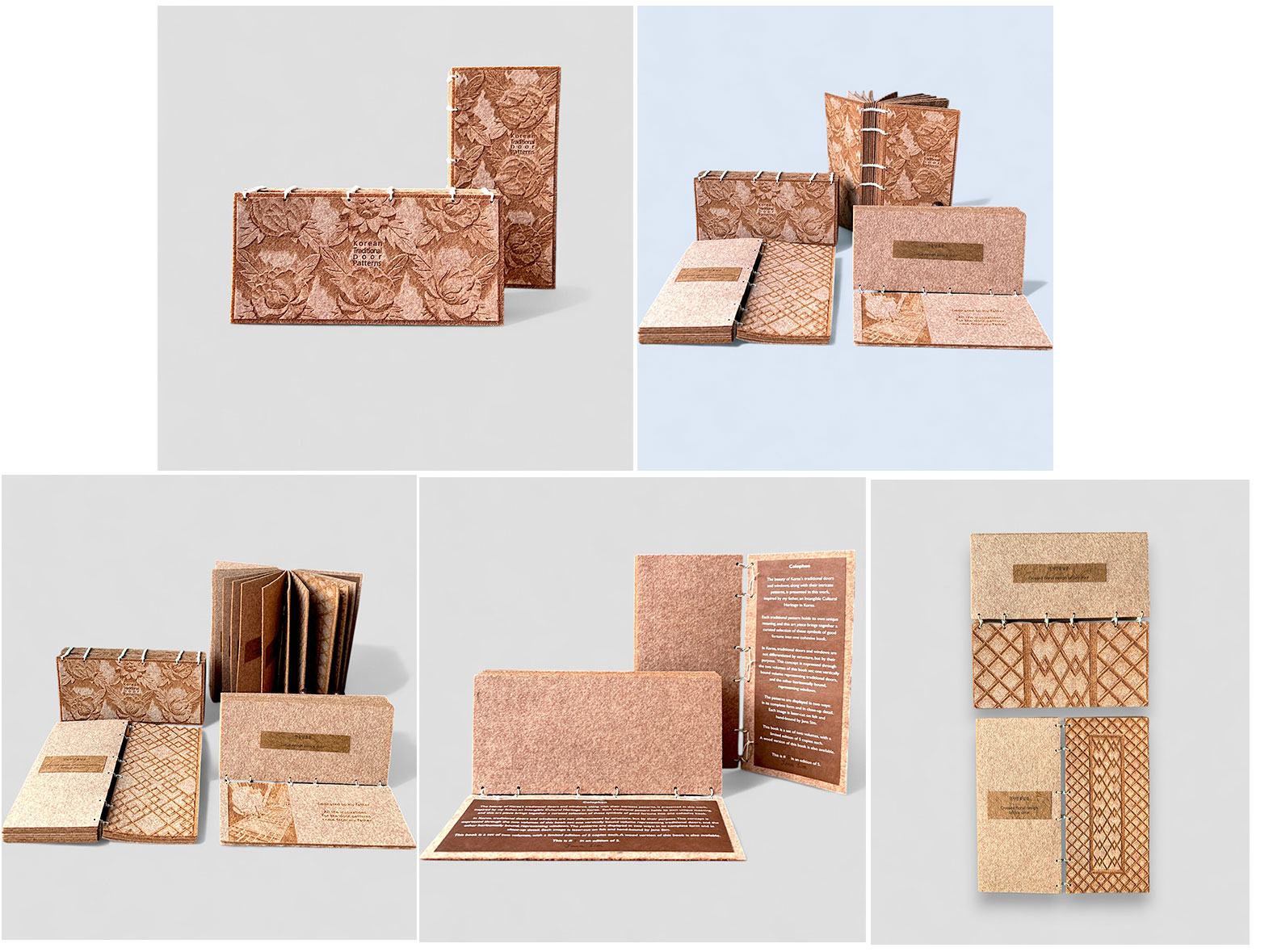
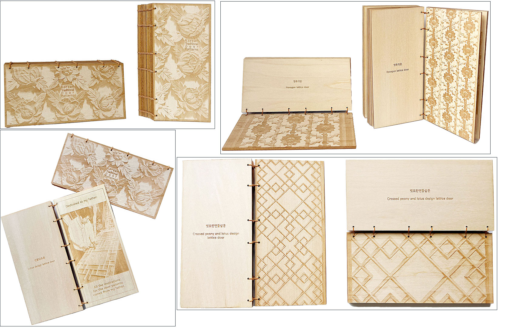
Korean Traditional Door Patterns 2025: Felt Edition. Two volumes each 3.5 x 7.5" and with 15 panels including front and back. Laser cut on felt. Handbound. The reverse side of each pattern panel includes a paper tip on with the name of the door pattern. Text is in Korean and English. Each volume signed and numbered by the artist. The vertical volume has a dedication panel to the artist’s father. Jana Sim: "The beauty of Korea's traditional doors and windows, along with their intricate patterns, is presented in this work, inspired by my father, an Intangible Cultural Heritage in Korea. Each traditional pattern holds its own unique meaning, and this art piece brings together a curated selection of these symbols of good fortune into one cohesive book. "In Korea, traditional doors and windows are not differentiated by structure, but by their purpose. This concept is expressed through the two volumes of this book set: one vertically bound volume representing traditional doors, and the other horizontally bound, representing windows. "The patterns are displayed in two ways: in its complete form and in close-up detail." |
 Click image for more |
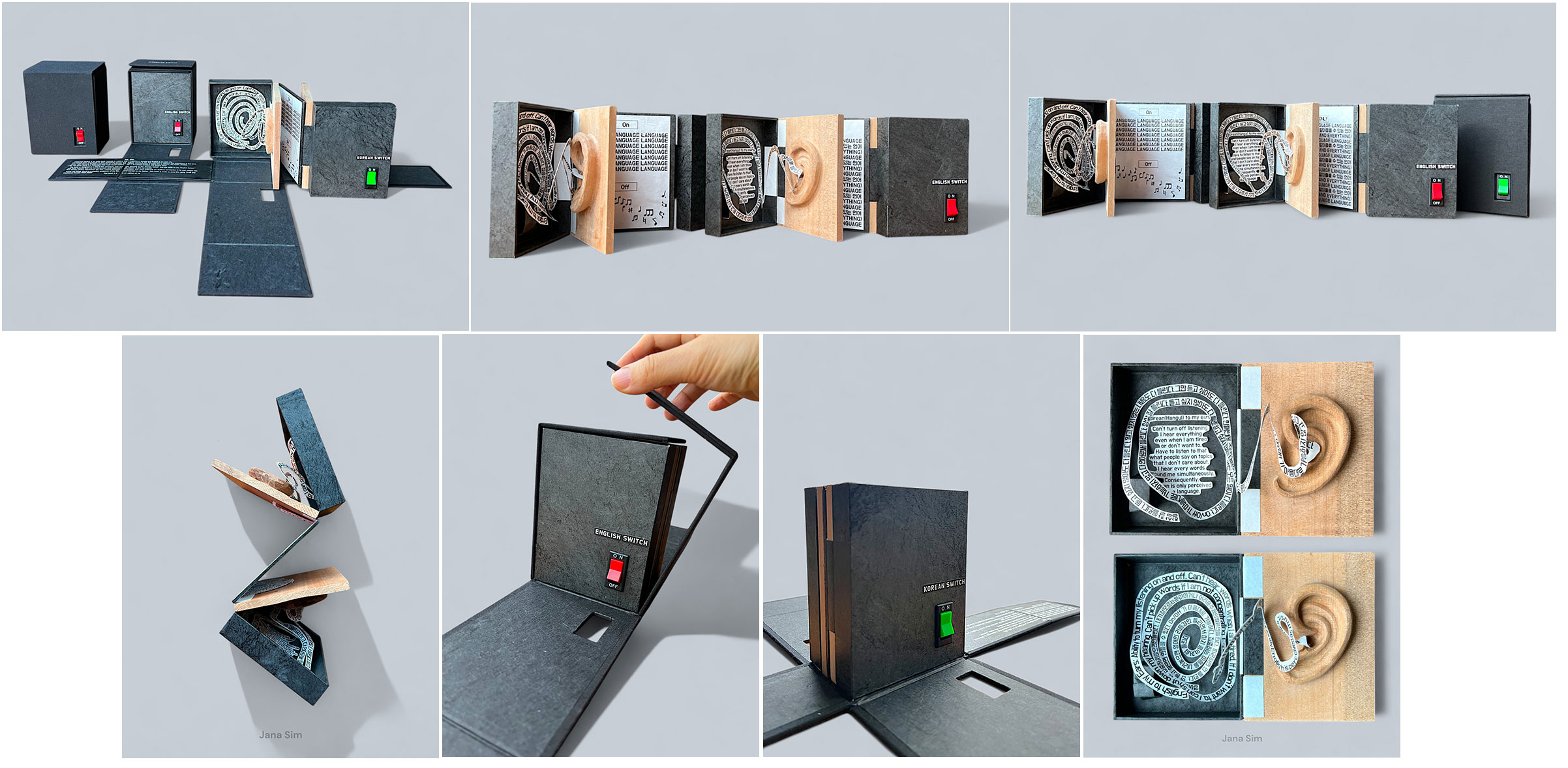
Language Switch Size: 4.25 x 5.5 x 3" / 22.5 x 19.5 x 6" (open). Two wooden carvings of artist’s ear crafted by her father. Materials include Tyvek and traditional Korean Hanji paper. Dos-a-dos structure. Custom enclosure wraps around book allowing for the on and off switches to be seen. Signed and numbered by the artist. Jana Sim: "’Language Switch’ is an artist book created to explore how I experience Korean and English in my daily life. I've always been fascinated by how differently Korean and English sound to me, and I wanted to capture that experience in this book. When I am focused, English is perceived as a language, but without concentration, it fades into a rhythm, like music. Korean, on the other hand, is a language that I can never switch off - It's always present and always there. “The book is designed in a Dos-à-Dos structure, with one side opening to the ‘Korean Switch’ and the other to the ‘English Switch.’ This style reflects how the two languages exist separately yet coexist in the same book. This design choice represents the way I switch between languages, with each affecting my auditory perception in its own unique way. “Inside the book, there's a wooden sculpture of my ear, hand-carved by my father.” |
 Click image for more |
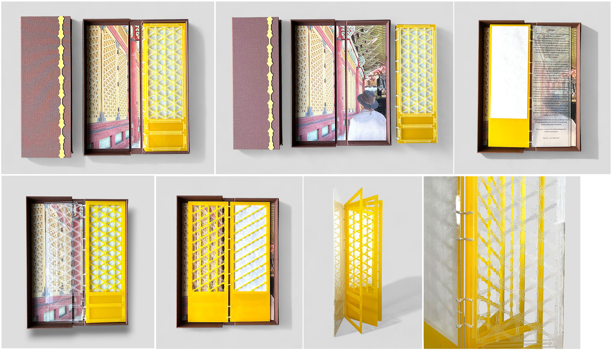
Layered Time - Grapevine Lattice 3.5 x 13 x 0.5";’ 5 panels, plus clear acrylic front and back panels. Colophon attached to interior of back panel. Laser cut patterns on acrylic. Cover board etched with pattern. Hand-bound. Signed and numbered by the artist. Laid in cloth covered clam shell with photo tipped in the interior of the box. Jana Sim: "’Layered Time’ is a visual representation of the intertwined memories from my childhood with the Korean traditional doors and windows. Inspired by the grapevine lattice, a symbolic pattern from the Injeongjeon Hall at Changdeokgung Palace in Korea, this piece came to life from the feeling that the layers built to create the doors resemble the way my memories build up over time. Just as these layers come together to form a single door, Korean traditional latticework, for me, holds my life's memories and experiences that continue into who I am today. “Growing up, I was always surrounded by traditional doors and windows because of my father recognized as an Intangible Cultural Heritage in Korean traditional woodworking. His workshop would always be busy, with latticework pieces ready to be sent to their destinations. My memories of latticework aren't of the completed doors or windows you might see in palaces or temples but rather the unfinished, assembled fragments in the process of becoming whole. Therefore, in my memories, my father's works were usually in an unfinished state, waiting to fit together, rather than in their fully assembled form. “This particular grapevine lattice pattern expressed in this book is from the door my father restored during my childhood. Revisiting the palace with him recently as an adult and hearing his stories about the restoration made me feel the weight of his dedication and craftsmanship, seeing him not just as my father but as a passionate cultural heritage artisan. Now, as an adult and being a parent myself, I somewhat understand the responsibility to pass down what he carries. “Each page in this work represents the lattice before it's fully assembled, captured in the layers. As an artist, the lattice symbolizes a personal connection for me-it's where my memories and experiences intersect with my past and present, building a part of who I am. “The photograph inside the box was taken on the day I visited Changdeokgung Palace with my father to see the actual grapevine lattice door he restored." |
|
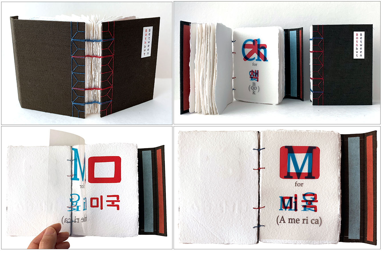
Both but Between 4.5 x 5.8"; 17 handmade paper leaves; 16 OHP film leaves. Letterpress printed on handmade paper. Laser printed on OHP film. Cloth covered boards. Exposed binding. Paper title label on front board. Signed and numbered by the artist. Jana Sim, colophon: "This book attempts to intersect two languages and comes in the form of an alphabet book using Hangul and English. "The Korean alphabet Hangul consists of at least one consonant and one vowel to make a syllable which forms one character. "Words have been selected that reflect my identity. I used the English alphabet but employed the structure of Hangul. By reflecting the Korean letter form and combing the two languages, this book opens a window for an English-speaking person into my struggle with a foreign language. "The Korean font used in this book is 'Hunmin Jeongeum', which is the original name for Hangul. The English font is 'Book Antiqua'." |
|
| Jana Sim Out of Print Title: | |
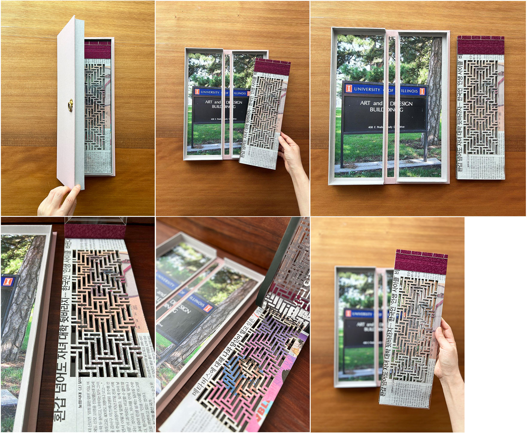
Connection 5 x 16 x 1.5"; 30 leaves. Laser cut on newspaper and acrylic. Korean traditional 5-hole binding with clear acrylic boards. Laid in cloth covered clamshell box with interiors of pictorial pastedowns. Materials : Korean newspaper, acrylic, handmade book cloths by Korean traditional fabric. Signed and numbered by the artist. Jana Sim: "Door symbolizes a pathway from one space to another. Living in the Unites States, the Korean traditional door was the link with my childhood reminiscence and with my family back home in South Korea. I grew up in an environment immersed in Korean traditional carpentry as my father is the national heritage in doors and windows. As a book artist, that nostalgia was expressed in my art works such as my oil painted ‘Korean Door on a Western Door’ and with my Korean traditional door themed book arts. However, returning to Korea and spending the next decade in a new role as a mother and daughter has given me a different perspective in the way I perceive the same theme. “A door sits between both ways, but once opened bridges two spaces with one another. Back in the United States, the Korean traditional door used to signify a pathway to my family and home country, a one-way direction. But now back in Korea it connects me to the time of my life where I was solely committed as an artist. For me, the Korean traditional door is the means of connecting the pivoting stages of my life, my past with the present, my home country with the United States, and myself as a mother with my life as an artist. " Internet definitions describe Bulbalgimun as the wisdom of using interior spaces well; and, octagonal Bulbalgimun as a Korean term describing doors built with latticed midsections that open into dimly- lighted rooms. Korean architecture has played a large role in Sim’s life as her father is a master carpenter. See article written about them in “The Korean times” The artist saved this last copy of “Connection” because the images include one that holds a lot of personal meaning for her. She says “It always brings back memories from my time in school, which is why I’ve held onto it. But I think I’m finally ready to send it off to a new home.” |
|
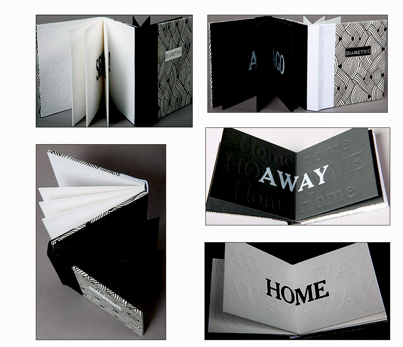
Diametric 3.5 x 3.5 x .75"; 16 pages including pastedowns. Dos-à-dos construction. Letterpress, embossing, and hot foil stamping. Papers: Somerset and Lokta. Bound in book cloth and cowhide leather. Paper slipcase with title label. Jana Sim: "The focus of my works are 'Where I am' and 'How I feel'; the difficulties I face living as an International Student; cultural differences between Korea and the United States." In Diametric the questions are as simple and profound as the difference in black and white, which are appropriately the dominate colors. |
|
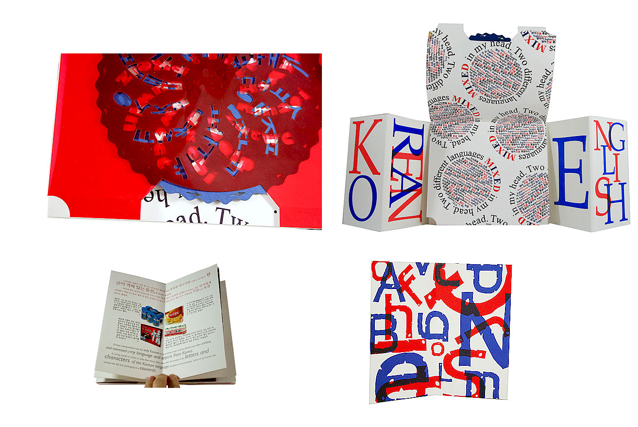
Konglish 8.5 x 7.5 x 1" (closed) 20 x 7.5 x 6" (opened); 28 pages. Various parts of the book are bound in gatefold and drumleaf formats. Most is letterpress printed using polymer plates on Somerset white velvet. Includes a volvelle of laser-cut Canford Royal Blue paper and Grafix Clear-Lay Red acetate. Laid in a box covered in eggplant-colored silk with gatefold lid. Button and thread closure. Jana Sim: "This book is about the differences between how language is observed and interpreted. When one knows a language it becomes natural and you are able to understand the meaning. However, upon seeing a language that you do not know it can be seen as merely beautiful shapes and not as text that you can read. The language then becomes a texture of patterns or images. "One side [of the gatefold structure] focuses on Korean and the other side on English. There are short, humorous stories in each language that I have personally experienced based on the differences of the languages and how they function in different cultures. How Korean appears to English speakers and how English appears to Korean speakers are different and sometimes led to funny mistakes and experiences causing misinterpretation or confusion. |
|
Korean Traditional Door Patterns Two volumes each 3.5 x 7.5” with 15 panels including front and back panels. Images laser cut on bass wood. Hand bound by the artist with exposed stab binding. Signed and numbered on the colophon of each volume by the artist. Jana Sim, colophon: "The beauty of Korea's traditional doors, windows and its patterns are presented in this work in the form of a book, inspired by my father, an intangible cultural heritage in Korea. The diverse traditional patterns each have different meanings to them and this art piece is a selected collection of those good fortune made into one book. “In Korea, there is no distinction in the traditional door and window, only its purpose and that is expressed in the two sets of the book. The vertical binding book represent Korea's traditional doors whereas the horizontal binding book represent windows. The patterns are displayed in two forms, for a complete and a closer detailed view." This two volume set is dedicated to Sim’s father who is a master carpenter. “The Korean times” featured an article about Sim Yong-sik as well as mentioning the relationship between father and daughter. |
|
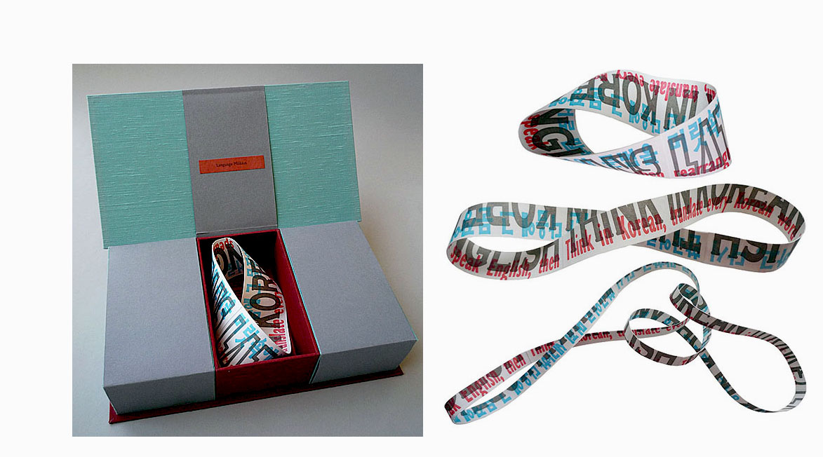
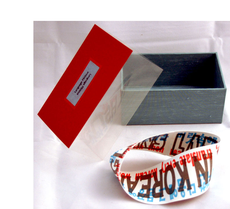
| Language Möbius By Jana Sim Chicago, Illinois: Jana Sim, 2011. Edition of 15. 10 x 5.5 x 2.5" magic wallet box using Jacob's ladder binding construction. Three sections containing Möbius strips. Letterpress printed from polymer plates on Somerset. Cloth-covered box with Moriki and Canford Papers. Paper title label tipped on. Signed and numbered by the artist. Jana Sim: "The most difficult part of learning another language is everyday conversation where an immediate response is needed. Language Möbius is about my conversation process. The loop in my brain goes like this: hearing English, thinking in Korean, translating, then speaking in English. There are two layers to the Möbius strip – it can be cut in half. With the first cut, the ring becomes twice as long. The next cut makes the two rings link together. With each cut the sentences of the layers are also cut in half, making it illegible. The final two rings lined together symbolize the two languages tangled up in the artist's head while in translation, which is why the sentences can’t be read." (SOLD) |
 Click image for more |
| Language Möbius By Jana Sim Chicago, Illinois: Jana Sim, 2011. Edition of 15. 5.25 x 3.125 x 2.25" lidless cloth-covered box housing one Möbius strip constructed of Somerset paper. Text in Korean and English is letterpress printed on the Möbius strip. Slip on band with three sides of clear acetate and top of heavy paper with colophon adhered to interior and paper title label on exterior. Signed and numbered by the artist. A trade edition of Sim's original book Language Möbius. While the original had three Möbius strips of differing sizes symbolizing the frustration of learning another language, this trade edition provides a single Möbius strip to illustrate and symbolize the difficulty. Jana Sim: "The most difficult part of learning another language is everyday conversation where an immediate response is needed. Language Möbius is about my conversation process. The loop in my brain goes like this: hearing English, thinking in Korean, translating, then speaking in English." (SOLD/Out of Print) |
|
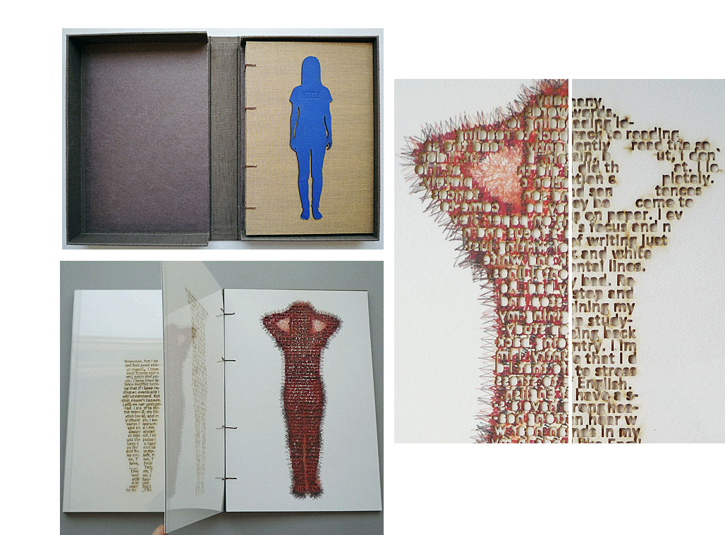
Meter 6.875 x 10.25 x 1.5"; 16 pages. Images and text printed using Epson Stylus Pro 9800 on Somerset Velvet Fine Art Paper. Laser cuts. Materials: leather, Moriki paper, plastic and linen thread. Single Page Coptic binding. Title blind embossed on a woman's silhouette of blue leather tipped on front board. The silhouette of an exasperated woman (hands on her head) of red leather tipped on rear board. Housed in brown linen clamshell box with title blind embossed on blue leather inset. Colophon: "The altered text in the body shapes came from the book Why is that Art, which was required reading for 'Connected Studio' part of the core curriculum for the Interdisciplinary MFA program at Columbia College Chicago in the fall of 2009." Jana Sim: "Meter is about how I feel when I read something that's too difficult. Many required readings as part of my studies in the Interdisciplinary MFA program at Columbia College, Chicago were very difficult for me to understand. Each page shows my stress level riding gradually. The English words and information pile up to the point where it feels as though my brain can't take this anymore. I took the outline images of myself gradually changing color as the stress gauge increases. The words inside the body are laser-cut backwards and are readable from the back of the page. They describe how I feel at each stage, as my distress becomes greater and greater." |
 Click image for more |
Page last update: 05.30.2025
Home | About Us | Contact Us | New Arrivals | Fine Press & Artists' Books | Broadsides |Resource Books | Order/Inquiry
Copyright © 2021 Vamp & Tramp, Booksellers, LLC. All rights reserved.