|
|
|
Notta Pixie Press
~ Washington
(Jenny Craig) |
Share this page:
|
| |
|
| Jenny Craig: “Nothing is a weird or amusing to me as real life. I'm inspired by the things I see around me and by creating alternate explanations for everyday phenomena. … I love the smell of the ink, the time it takes to carve and set and print. I love working by hand: I feel like can lose myself in the process. I also particularly like working in a shop with friends. We share the frustrations of our lives over the sounds of the presses at work, and get instant suggestions if something's not working out well.” |
| |
|
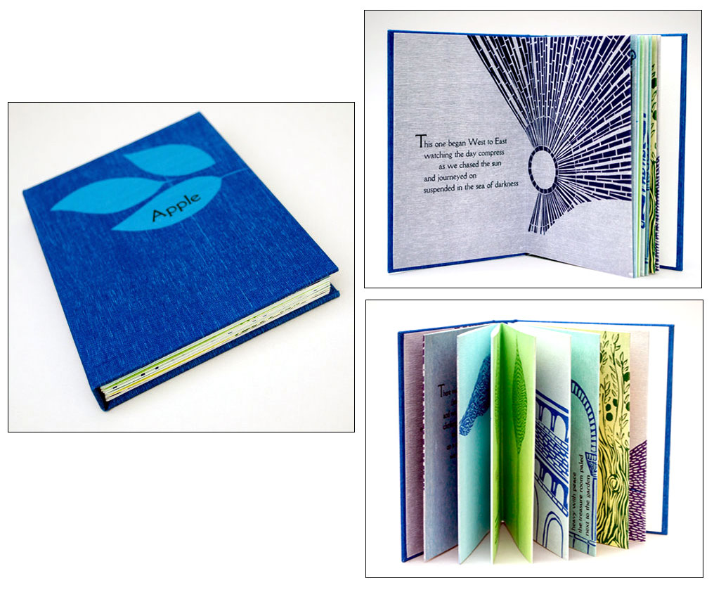
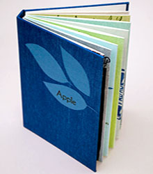
Apple
By Jenny Craig
Seattle, Washington: Notta Pixie Press, 2016. Edition of 15.
5 x 7" closed, extends to 24"; 10 pages including pastedowns. Accordion flutter structure. Letterpress printed. Linoleum cuts. Handset Della Robbia type on Revered Suede paper. Bound in blue cloth boards. Signed and numbered by the artist.
Jenny Craig: "This is a little story, about a journey to New York. It’s also about seeing a friend, traveling within the greater journey, architecture, and imagery. It can be read very literally, or very figuratively, and it can be my specific story, or a story that others will recognize their own travels in. Mostly, I wanted to remember a weekend in New York and this is what came out of that. Did I literally kiss the statuary? Yes, yes I did. If you can figure out where we were based on the description, you might even know why.
"I didn't mean to get quite so carried away in making this, but it's all original linoleum cuts and handset type. Each page printed 4 times on the press -- 2 for the background color, then the image, then the type."
$175 |
 Click image for more
 |
| |
|
| |
|
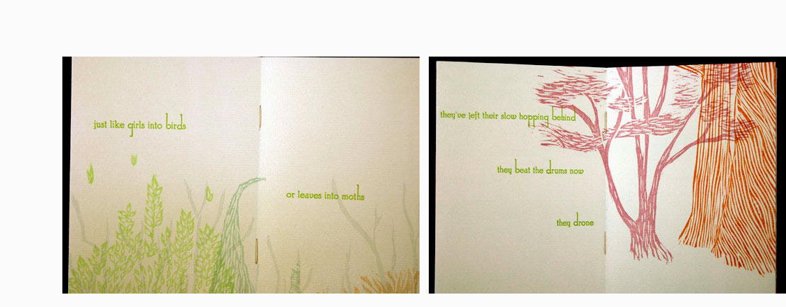
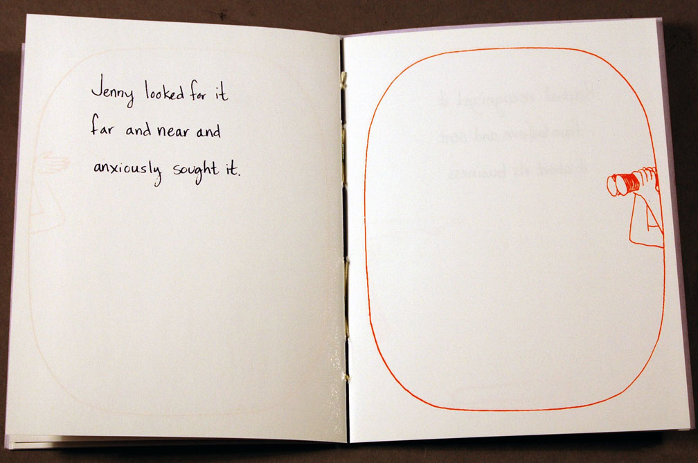
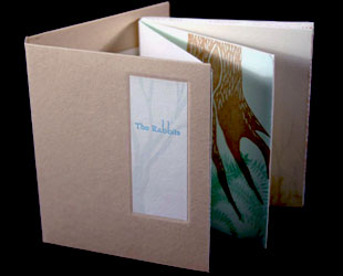
The Rabbits
By Jenny Craig
Seattle, Washington: Notta Pixie Press, 2011. Edition of 14.
4.25 x 5.75"; 14 pages. Letterpress printed using handset Parsons type and original woodcuts. Sewn binding. Slips into heavy paper case with tipped on illustrated title label. Laid in box with title label.
Colophon: "An imagining for those of us who remember the warren in Woodland Park."
Jenny Craig: "I moved into a basement apartment in Seattle near Woodland Park, and quickly discovered the large warren of rabbits that lived there. They were clearly abandoned domesticated rabbits, in all shapes and sizes, and there were hundreds of them. There were two in particular that used to come hang out in my yard - a large ginger rabbit and his friend, a little black and white spotted lop. They'd just hop around the yard, grazing on the grass (but never on my plants that I noticed). Now, there were all sorts of concerns being expressed by the city about those rabbits - and signs up everywhere asking people not to drop their bunnies off. The city said that the warren was vulnerable to disease and there was a big rabbit relocation group that was working on a plan... [A]nd about a year later they were trapped and relocated to a rabbit sanctuary. In any case, the warren is empty now.
"Not too long after the great rabbit removal I noticed that a group of bagpipers were meeting in the park to practice, near the old warren. On summer evenings, you can hear them at least a couple of times a week, and it's not just one piper, it's 4, with 3 or 4 drummers in addition. They're really something to watch.
"As far as the book goes, I felt it was important to let the reader make up their own context, and to leave the rabbits to the imagination. It's a book about the absence of rabbits, and about the wood that lives in memory and imagination."
$120 |
 Click image for more
 |
| |
|
| |
|
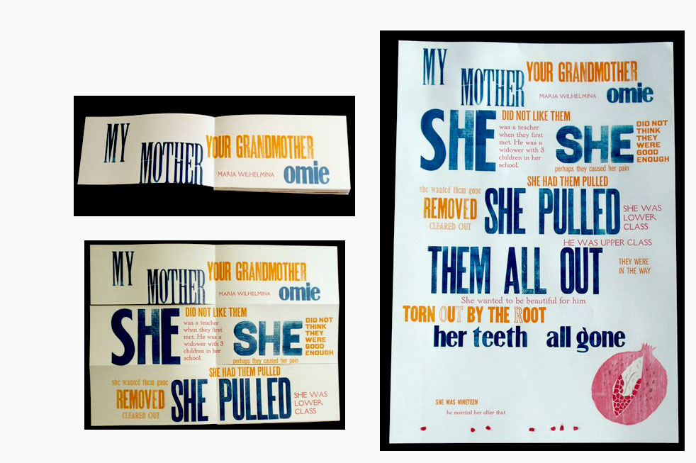
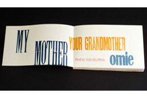
Omie 1
By Jenny Craig
Seattle, Washington: Notta Pixie Press, n.d. Edition of 30.
17.75 x 25", single sheet folded, variation on a maze book. Printed on a Vandercook proofing press using wood and lead type, wood- and linoleum cuts. Printed on Canson Mi-Tientes paper. Laid in cloth bound letter-fold cover with a tooth blind embossed on the front.
Jenny Craig: "Omie 1 is my grandmother’s story as I imagine it. Neither my mother nor I know very much about her, but one of the stories that came down is that she had all her teeth pulled when she was young and always wore false teeth. I recently found out that this happened about the same time she met my grandfather. Apparently this is what people did before the advances of modern dentistry, but it still strikes me as an act of self-violence, requiring great force of will."
$150 |
Click image for more
|
| |
|
| |
|
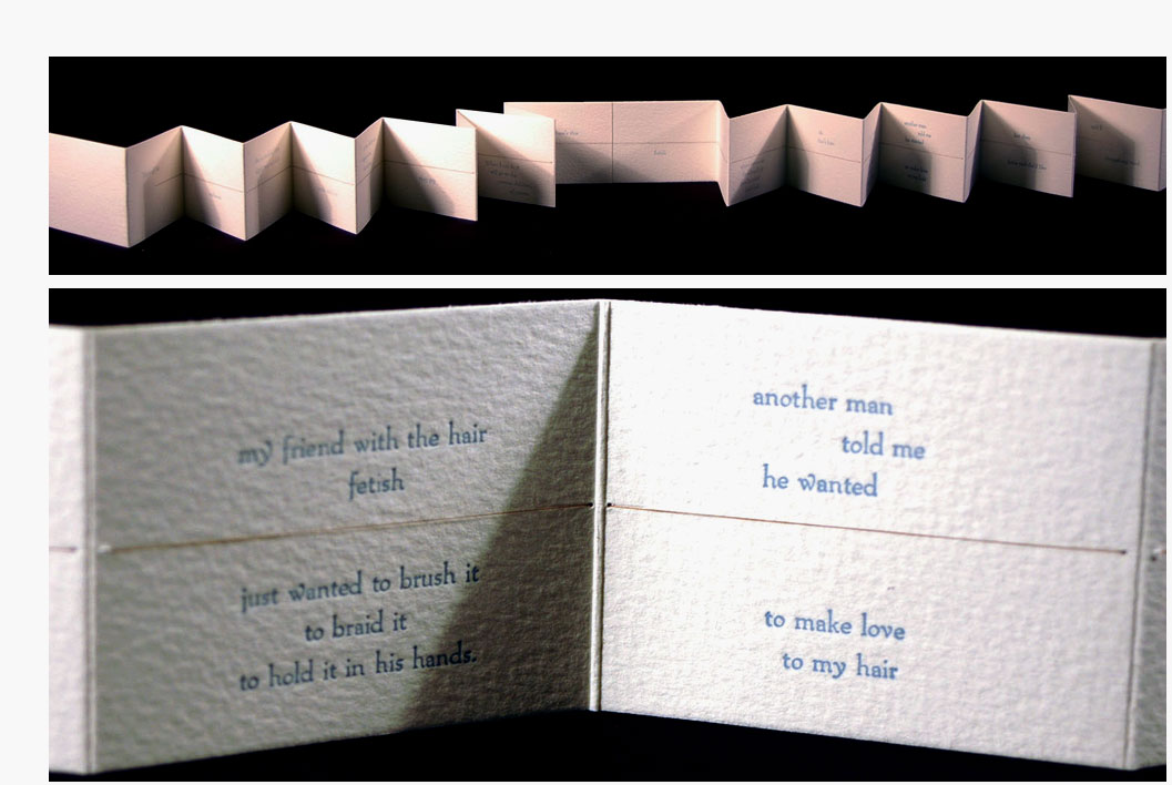
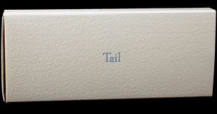
Tail
By Jenny Craig
Seattle, Washington: Notta Pixie Press, 2007. Edition of 51.
1.9 x 5.2"; 22 pages. Housed in 2.25 x 5.25 x .5" lightweight matchbox-style slider box. Letterpress double accordion book. One of the artist's hairs sewn along the length of the book. Printed on Chandler & Price press using 10 point Packard type and Arches paper.
Jenny Craig: "Tail was originally conceived for a show called "Sense and Sensuality." The idea is to articulate some of the things I am thinking when people walk up and take liberties with my hair. It's incredibly satisfying to put it in print, but don't take it too seriously, because I don't."
$75 |
Click image for more
|
| |
|
| |
|
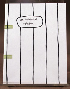
An Incidental Relation
By Jenny Craig
Philadelphia, Pennsylvania: 2005. Edition of 65.
4.25 x 5.5”; 36 pages. Screen printed, illustrated and printed by Jenny Craig at UARTS in Philadelphia.
Produced on Sterling Ultra Matte paper. Features an original binding structure created specifically for it.
Jenny Craig: "This is a tale, á la Edward Gorey, of a mysterious object and its impact on my life and the lives of my friends. It is a true story related in an oblique narrative with extremely minimal illustrations. I think perhaps nothing is as amusing as real life."
$15
|
Click image for more |
| |
|
| |
|
Offerings
By Jenny Craig
Philadelphia, Pennsylvania: Notta Pixie Press, 2005. Edition of 5.
16.25 x 10.25" Two variable editions (an Alpha edition and an Omega edition, see below for difference in the editions) of five similar books each. Because the paper is hand-made and individually tea-dyed, each book is slightly different and therefore unique. Produced at the University of the Arts in Philadelphia. Letterpress printed on hand-dyed handmade paper. First and final leaf composed of Unbleached Abaca and Cotton fibers. Middle two sheets composed of Abaca and Cotton Fibers. All papers handmade and tea-dyed by the artist. Bound in a historical tacket style inspired by works in the American Philosophical Society collection. Intended to be displayed standing, with the four poetic leaves open. Handmade paper wrapper of Hemp fiber with an Unbleached Abaca and Cotton interior.
Jenny Craig: "This piece was developed both as part of my Master's Thesis show, and in hopes of entering it in the Hunterdon Museum of Art's show "Elements: Creative Fire." I intended this piece as a meditation on the four elements, the seasons, superstitious beliefs and the changing landscapes that I have left behind me as I've moved across the country.
"It is an Offering in that each set of poems offers the reader one of my most vivid memories of time spent with people dear to me; and, each set links a physical offering with the element it is meant to represent. The entire book is dyed with tea, and only tea. To create the first page (Earth, Spring) I allowed a vat full of tea to boil dry with part of the paper exposed, thus creating a sediment that bonded to the surface. The second (Water, Summer) was created by cold dyeing the base sheet and then applying a rapidly cooling tea after the first dried. The third (Air, Autumn) effect was created by folding the paper and submerging it for a short time in cold tea. The final sheet (Fire, Winter) is the product of accident. I used a hotplate and an aluminum paint roller tray, which after a certain time under unknown conditions will sometimes oxidize onto the paper while it is submerged. My continued experiments were unable to determine a consistent technique; fortunately I managed to get ten good ones out it before it stopped working. I made the mottling on the Hemp cover by pouring raw tea onto the wet paper while it went into the drying box.
"As you will probably imagine, there is significant variation in the sheets book to book, which I embrace. I enjoy making edition work, but it pleases me to offer each person who owns this book a unique artwork as well. The difference between the two editions of five is that the second edition, (the omega edition) is occasionally reversed in dye and therefore poem placement, and the air poem has a final line which was omitted from the alpha edition."
$250 |
Click image to enlarge
|
| |
|
| |
|
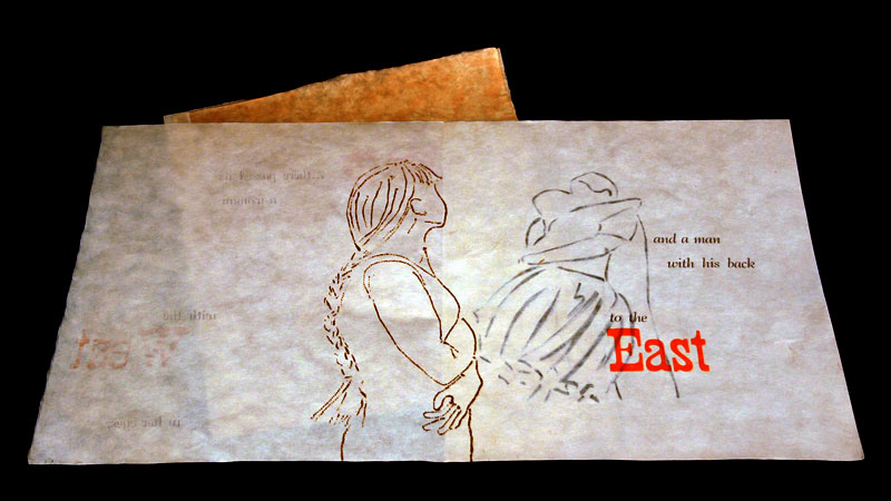
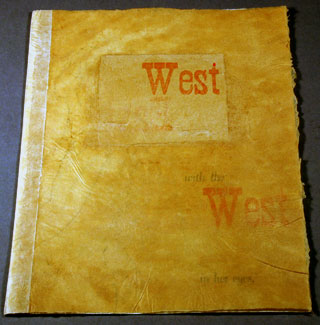
West/East
By Jenny Craig
Philadelphia, Pennsylvania: 2004. Edition of 5.
15.75 x 12.5". Letterpress printed at UARTS in Philadelphia. String Collographs and Pochoir. Illustrated and printed on Thai Mulberry paper. The cover is fashioned of handmade Unbleached Abaca and Cotton Fibers. Printed pieces imbedded during the drying process and waxed to preserve the transparency.
Jenny Craig: "This book features a quote from the poem Unwelcome by Mary Elizabeth Coleridge (1861-1907). The book is an experiment in transparency and intended to be displayed standing open.
"This book was my first piece to incorporate another person's writing. I chose this excerpt both because it spoke to me as a transplanted student missing Seattle, and as a Coleridge (Samuel Taylor) scholar from a future life. I was also deeply involved in papermaking when I began developing this piece and extremely interested in both the transparency of drying paper and the tactility of organic materials."
$225 (Last two copies) |
Click image for more |
| |
|
|
| Out of print and sold titles by Notta Pixie Press: |
|
| |
|
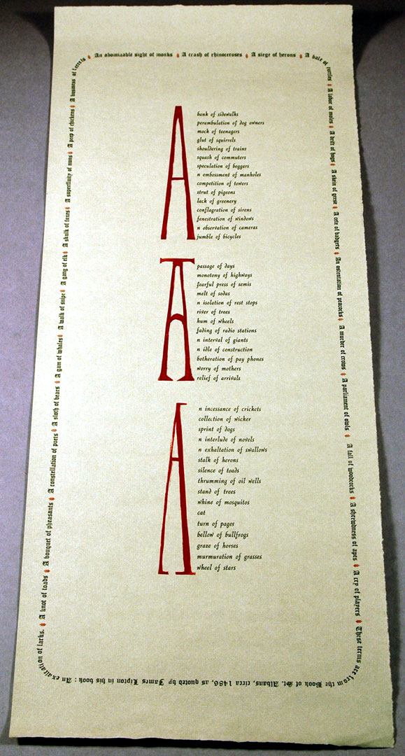
A Broadside
By Jenny Craig.
Philadelphia, Pennsylvania: 2004. Edition of 24.
24.625 x 9.625" sheet letterpress printed on Hahnemüle Ingres paper using a Vandercook Press at the University of the Arts in Philadelphia.
Jenny Craig: "This broadside celebrates group nouns in all their glory, past and present. The group nouns that form the border are from “The Book of St. Albans” (a manuscript from 1486) as quoted by James Lipton in his book An Exaltation of Larks.
"The three poems in the middle are my own creation, and chronicle my morning commute to school in Philadelphia, my frequent road trips, and my mother's house in Texas. They are intended to highlight Urban-Rural transition, and are an example of my delight in language and my interest in medieval subjects. The large capitals were hand carved out of wood. The poster was printed in four passes, two red and two black, as there was only enough type to print half at a time. So, it was broken down and reset in between."
(SOLD) |

Click image to enlarge |
| |
|
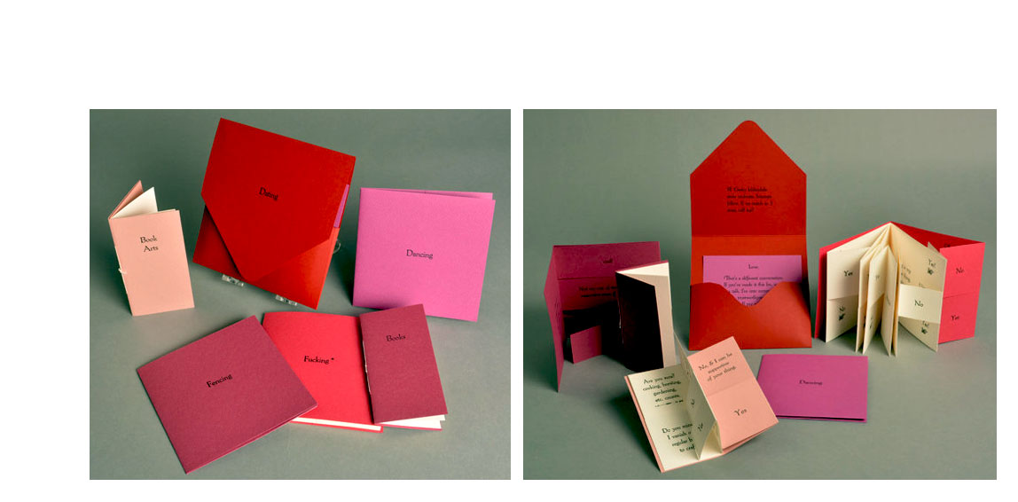
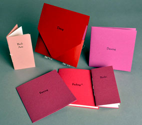
Dating
By Jenny Craig
Seattle, Washington: Notta Pixie Press, 2013. Edition of 35.
5.75 x 5.75" closed envelope enclosure containing 5 pamphlets and a card. Letterpress printed on Magnani Acqueforte text and Canson Mi-Tientes cover, using handset Packard type.
Jenny Craig: "Dating is part personal ad, part consolidation of my thoughts based on prior experiences. It is meant to be funny, but also to seriously examine and question the expectations brought to romantic encounters. It is a very personal work, but my readers seem to find themes that resonate with them as well. The book consists of an envelope enclosure holding 5 small pamphlets and a card. The pamphlet books ask questions and provide a choose-your-own-adventure of sarcastic answers. Language not suitable for children."
(SOLD) |
 Click image for more
 |
| |
|
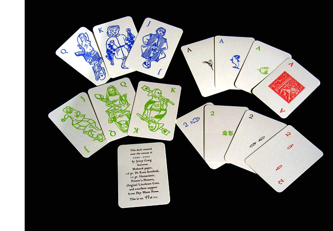
Deck of Cards
By Jenny Craig
Seattle, Washington: Notta Pixie Press, 2003. Edition of 50.
2.75 x 4"; 52 cards. Featuring 36 pt De Roos Semibold, 12 pt Humanistic, Printer's Flowers and original linoleum cuts on Mohawk paper. Printed at Day Moon Press in Seattle. A paper band wraparound closure.
Jenny Craig: "I created this hand-set of cards during my early attempts to learn relief printing on a Chandler & Price Platen press. It is a standard deck in content; but, the suits each feature their own color. The numbered cards are represented with printers' flowers and the face cards with hand-cut linoleum images. The images reference the medieval conceit of the estates of man: Nobility, Merchants, Peasants, and Clergy. The deck of cards also reflects elemental change in the suits: Earth (flowers), Air (feathers), Fire (flame), and Water (fish). The aces vary with the deck, but each embodies the theme of the suit. Each card also features a four color back design and each deck comes with a card that describes the work."
(SOLD) |
Click image for more |
| |
|
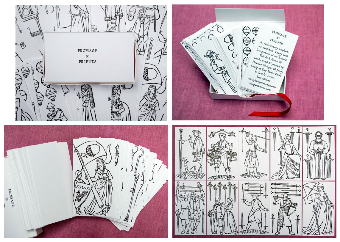
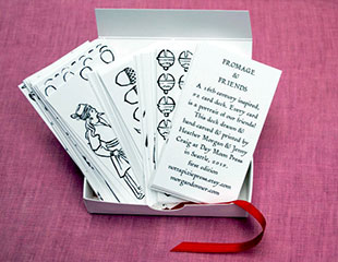
Fromage & Friends
By Jenny Craig and Heather Morgan
Seattle, Washington: Notta Pixie Press, 2016.
Open unnumbered edition.
2.25 x 4"; 52 playing cards plus instruction card. Black and white letterpress printed. Images drawn and hand-carved by the artists. Laid in handmade paper box with ribbon lift.
Jenny Craig: "This is a 16th century inspired handmade card deck. The cards are all portraits of friends who are medieval re-enactors in the Society for Creative Anachronism. Each card was designed and drawn by Heather Morgan and then carved in linoleum and printed by Jenny Craig.
"This is a 52 card deck, and can be used just like a modern one; however, it is based on the extremely common German style in the 16th century, where you have a Unter (Under), Uber (Over), and a King, instead of the common modern Jack, Queen, King."
The artists invite you to color the images using watercolor paints, markers, or pencils.
(SOLD/Out of Print) |
 Click image for more
Click here for the link to Instagram |
| |
|
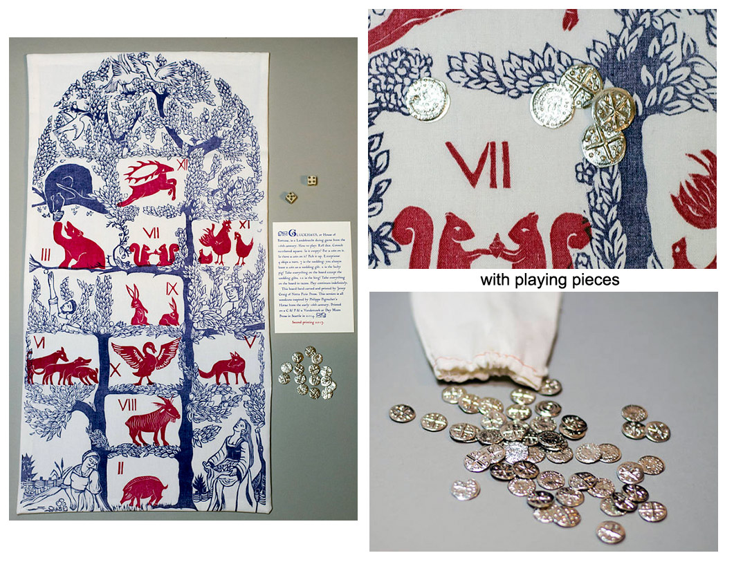
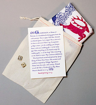
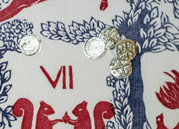
Gluckhaus
By Jenny Craig
Seattle, Washington: Notta Pixie Press, 2007. Second Edition.
23 x 12" single sheet of cloth. Originally printed by Jenny Craig over the course of 2002-2003. This is the second edition, an unnumbered edition, printed in blue and red during 2007. Handcarved linoleum blocks printed on muslin using a Vandercook press. Includes a letterpress instruction card.
Jenny Craig: "Gluckhaus is a Landsknecht [mercenary German pikemen] dicing game from the 16th century. The name means 'House of Fortune'; it is played with two dice and is designed to pass the time. The board has numbered squares. After rolling a pair of dice, consult the square. If it is empty, deposit a penny on it. If it has a penny on it, collect the penny. Special features: roll a 4 and skip a turn, a roll of 7 is an invitation to a wedding, and since everyone brings a gift to a wedding, you always leave a penny on this square. The lucky pig rolls a 2, and collects everything on the board except the wedding gifts, and a roll of 12 crowns you king, so you get every square in taxes. Play continues indefinitely.
"I am intrigued by games and cards, as they present an opportunity for lavish illustration and the use of symbols. To me the representations within a game are a different kind of language, and I enjoy playing in that realm, where both visual and verbal are important to create understanding. This board was heavily influenced by images from early woodcuts (primarily 14th and 15th century), and by allegorical and iconic figures. Here you will find reflected the medieval concept of the estates of man: Nobility, Merchants, Peasants and Clergy, and also the traditional rites of passage that define life: birth, marriage and death."
(SOLD/Out of Print) |
Click image for more
|
| |
|
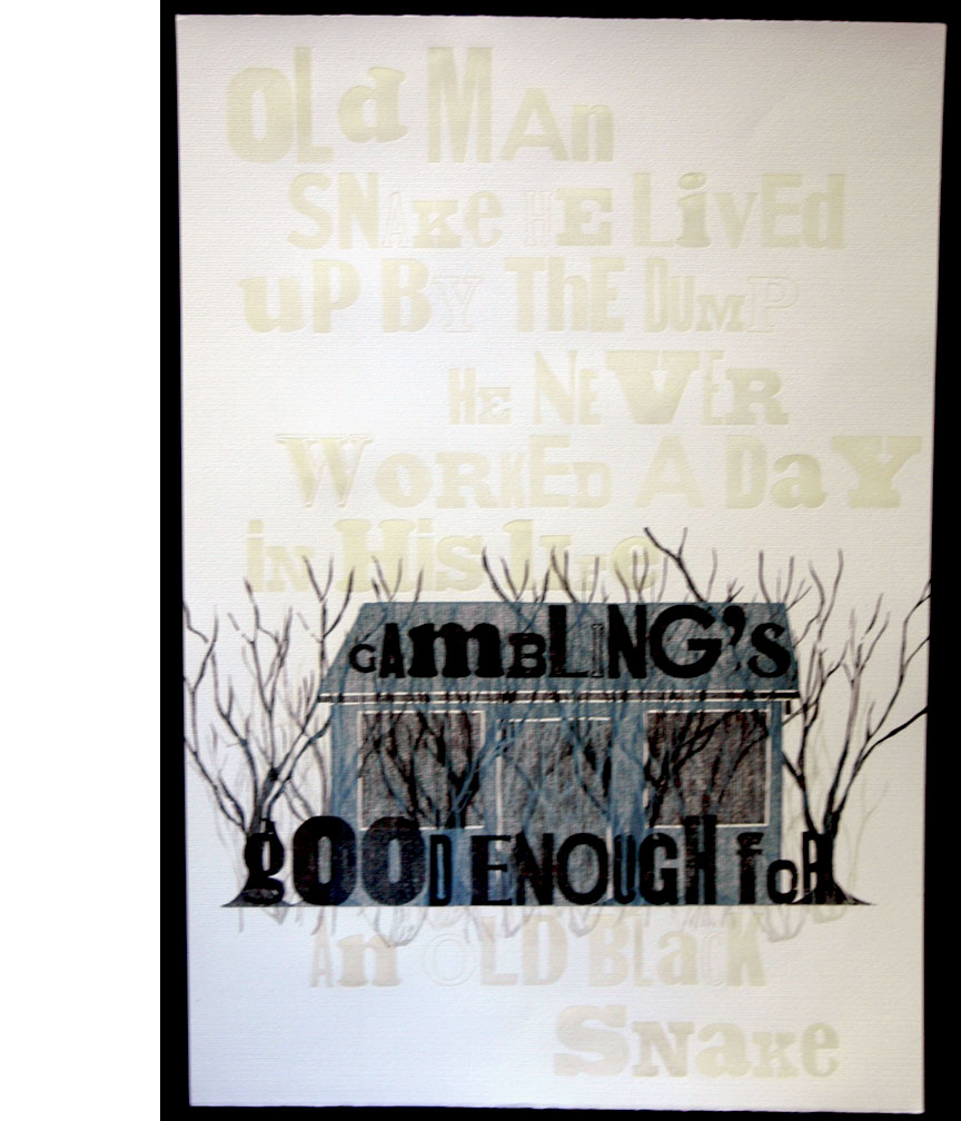
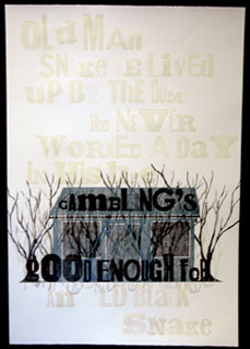
Henry Owens, Called Snake
By Jenny Craig
Seattle, Washington: Notta Pixie Press, 2009. Edition of 38.
13.5 x 19.75" broadside. Letterpress printed with found wood type on Magnani Acqueforti paper. Wood cuts printed repeatedly on a Vandercook press.Linseed oil based ink.
Jenny Craig: "Old man Snake lived down the road from me when I was a kid. He seemed ancient to me, and we'd see him wandering down the road every now and again. He dropped by on Christmas morning one year when I was very young, and I remember him telling me a story. He said that he had never worked a day in his life - he won all his money at the casinos. I don't know if that's true. He had a little cabin which you could see from the road, down on some land right next to the dump. The mesquite is swallowing it up, now, bushes growing all around and through it. I asked about Snake when I went home to visit last year and one of the other neighbors said he'd been gone for years. She said he always used to give her 'that good old slovacek sausage' in thanks because she'd make sure he had enough to eat on a regular basis. They called it snake sausage around her house.
"This print is a bit of a memorial, in the sense that if I don't remember him, I'm not sure who else will. It's also just a reaction to the beauty of that cabin being returned to the landscape. In my head, too, it's not like he had a firm death or leaving date. He was there in the background and then at some point, he was not. I like to think maybe he shed that body and has gone off into the weeds as an old black snake. I think he might have been ok with that."
Old man snake he lived up by the dump he never worked a day in his life gambling's good enough for an old black snake.
(SOLD) |
Click image to enlarge |
| |
|
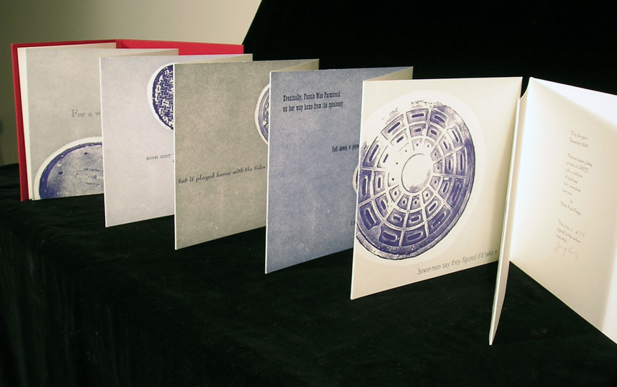
Sewers
By Jenny Craig
Philadelphia, Pennsylvania: 2003. Edition of 17.
9 x 8"; 16 pages. Letterpress printed at University of the Arts in Philadelphia. Illustrated and printed on Stonehenge paper. Accordion style structure. Case bound with a false spine that allows the text block to be pulled out and displayed in full.
Jenny Craig: "This book represents my answer to a class exercise at UARTS. The members of the class were challenged to each bring in two small snippets of writing (not our own) and two images (also not our own). We placed all of these into a hat, and each person drew two images and two random writing samples. We were then asked to produce a book in response to these four elements, utilizing the original object as much as possible. This unique set of circumstances led to my first foray into modern myth-making. In it, I relate the origin of round manhole covers, and call attention to the fascinating variety of imagery beneath our feet. I was walking around Philadelphia a lot that semester.
"I used both images that I drew: the small giraffe on the cover and the portrait of Fannie Mae Farmbrook. The writing snippets were more difficult to incorporate. I remember that one was about Mom making the basement a place of her own - that she stayed in the basement with the cats. In my mind (and probably no one else's) this translates to the moon underground. Excerpts from the second sample, about tides, are reproduced on the manhole covers within the book."
(SOLD) |
Click image to enlarge
|
| |
|
Page last update: 02.19.2022
|