
|
Brad Freeman
~ California
|
Share this page:
|
| Brad Freeman: “Within a book, artists can explore many facets of an issue over time building complexity and resonance as the pages are turned. A single image exists within the context of what happened before and implies what might occur on future pages. Because they exist as portable multiples, the books become traveling exhibitions and over its lifetime can insinuate itself into unforeseen locales.” | |
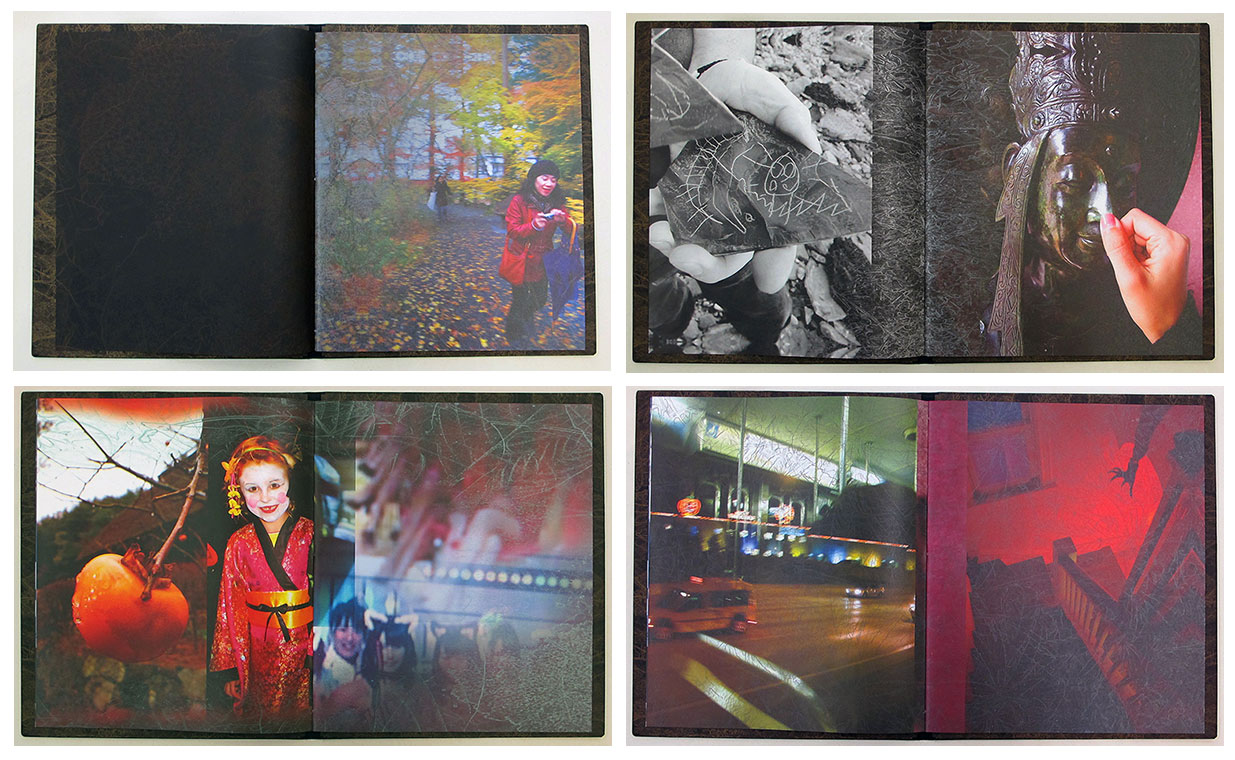
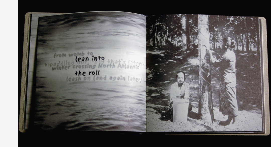
WE TOO 11.75 x 8.75"; 68 pages. Casebound. Contains two inserted books— "KOREA—JAPAN—1963", 24 pages, 9” (h) x 5.625” (w); and "HISTORY OF THE WORLD WAR", 16 pages, 5.375” (h) x 3.75” (w). Mohawk Superfine and Asuka kozo papers. Glassine envelope attached to back pastedown holds “History of the world” and the 8 page colophon. Offset printed and hand bound by Brad Freeman. Signed and numbered on the last page of the colophon. Savannah-Rae Squair, Bath Spa University: “ [Freeman] sees it [We TOO] as a ‘visual narrative’ and now appreciates the relationship between photography and narrative in a way he did not before. The book contains a short series of photographs that his father took while based in Korea and Japan. Brad has carefully selected and arranged the photographs to reflect the perspective of the world that his father revealed. The book, printed on Japanese paper and bound in a traditional Japanese way, ranges from photographs that capture the simplicity of a Korean woman doing her washing to ones that show the devastation and ‘perishing’ of the public in the Hiroshima bombings.” The eight page colophon explains some of the motivations, content, and form of WE TOO as well as the locations and dates of the photos, printing ink color and the making of the book. The last page of the book lists the location and date of the photographs by page. Brad Freeman, colophon: "Among other things WE TOO contains a sentimental homage to my father using some of his photos—and an expression of love for a friend—floating along in various page-to-page sequences, interventions, ruptures, recapitulations, and associations that hopefully convey some of my views about the world and the bookness of the book. "Like my mentor Joe Ruther I use the offset press as a painter uses a brush—this last phrase from Eugene Feldman who was an artist also using the offset press this way. Ruther intervened at all stages in the print process from photograph to darkroom (pre-digital) to plate making and ultimately during the actual offset printing. The results of this activity could not be predicted exactly but they presented many surprises which introduced new methods of working. Ruther called this play—in art school parlance, thinking and making. "I offset printed WE TOO on the Heidelberg GTO (eine farben) at the Center for Book and Paper/Columbia College Chicago between November, 2018 and March, 2020. The paper is Mohawk Superfine and Asuka kozo. All photographs and design are mine except where noted. The binding was completed at my home studio in Chicago. Many of the sheets of paper in this book were re-purposed using already printed and leftover sheets from some of my earlier artist books. I overprinted these sheets—first with black ink then metallic ink surprinted on top of the black—I was hoping to create more visual complexity, ambiguity, beauty, and meaning with the images. "The inserted 24 page book titled KOREA—JAPAN—1963 contains photographs by my father Tom Freeman. In this post-mortem collaboration I arranged his photographs as a way to create a sequence that may approach in substance his values concerning the world as it was circumstantially presented to him. The sequence starts on an army base where he was stationed close by the DMZ between North and South Korea. The book ends with photographs he took in Hiroshima at ground zero of the 1945 atomic bomb blast. Some of the text and images, including my photographs, in WE TOO are responses to my dad’s photographs." |
|
brocade in the dark of night 11.5 x 9.5"; 32 pages. Offset printed. Bound in printed paper-covered boards with cloth spine. Signed and numbered. Brad Freeman: "The title for 'brocade in the dark of night' is a quote from The Tale of Genji by Murasaki Shikibu. 'Autumn leaves that fall in the mountains, with no one to see them, are like brocade in the dark of night.' (translation by Royall Tyler). "[S]some of the images ... are from the Japan Project [Brad Freeman, 2013-14]. The sheets are some of the leftover offset pages. ...The offset printing process necessarily produces a lot of printed paper and as there were only ten in the edition of the 'Japan Project' I decided to repurpose some of the remaining pages. I folded each sheet and inserted them into a signature in the order as they appeared in the 'Japan Project' and sewed the signature. To my surprise and delight a compelling and perfectly ordered arrangement was the result. This probably had something to do with the original pagination of the Japan Project. And the dark dark pages with patterns that drift into blackness reminded me of the rather melancholy yet beautiful and poignant quote from The Tale of Genji, which I had read as part of my research for the Japan Project. Sometimes the two works - Japan Project and brocade in the dark of night - make me think of variation on a theme, like in music. And to me this makes sense because there is definitely the influence of music when I'm considering the flow of images and pages in the book form." |
 Click image for more |
| OZ July - Aug 2015 By Brad Freeman Chicago: Brad Freeman, 2016. Edition of 100. 6 x 9.5"; 106 pages including free-end pages. Printed on Mohawk Superfine ultrawhite smooth 100 lb text. Printed on a Heidelberg GTO52 ein farben. Printed images created with CMYK, tritones, metallic inks, and "secret sauce." Bound in paper over boards with cloth spine. Signed, dated and numbered by the artist. Brad Freeman, Colophon: "Oz is a visual poem based on photographs taken during my stay in Australia in July and August, 2015. The impetus for the trip was the Artist Book Brisbane Evenet (ABBE) at the Queensland College of Art, and I decided to extend my stay, because, who knows, I may never go to the Antipodes again. The photographs retain a trace of their documentary aspect and provide the foundation for this poetic response to a history of Australia, which starts and ends in a conception of Aboriginal dream time. This book was created before and during the printing - printed sheets provided areas, forms, and ideas to grow the project in ways unseen at the beginning." Includes table with image identifications corresponding to the sequence of pages in each of the four signatures. Brad Freeman: "The idea of identifying the locations where the photographs were taken comes from Yutaka Takanashi's book Toshi-e (Towards the City). And with this gesture Takanashi acknowledge the documentary essence of photography in his extraordinary visual poem. "Sewn into the colophon pages of the book is another, small book (there are actually two small books sewn into OZ). The little book in the colophon area contains all the words that are printed in OZ. I thought of this after the printing was completed for the book itself (OZ). The reason is that in the colophon I state that OZ is a visual poem, but in fact there are a LOT of words in it and the words are very much a part of the meaning of the book. And I thought if the words were presented this way that a further meaning, a type of re-reading, could occur for the perceptive viewer." $250 |
 Click image for more |
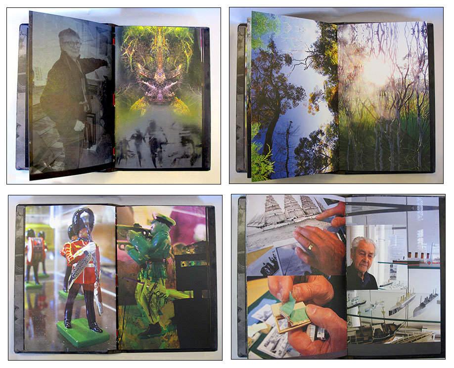
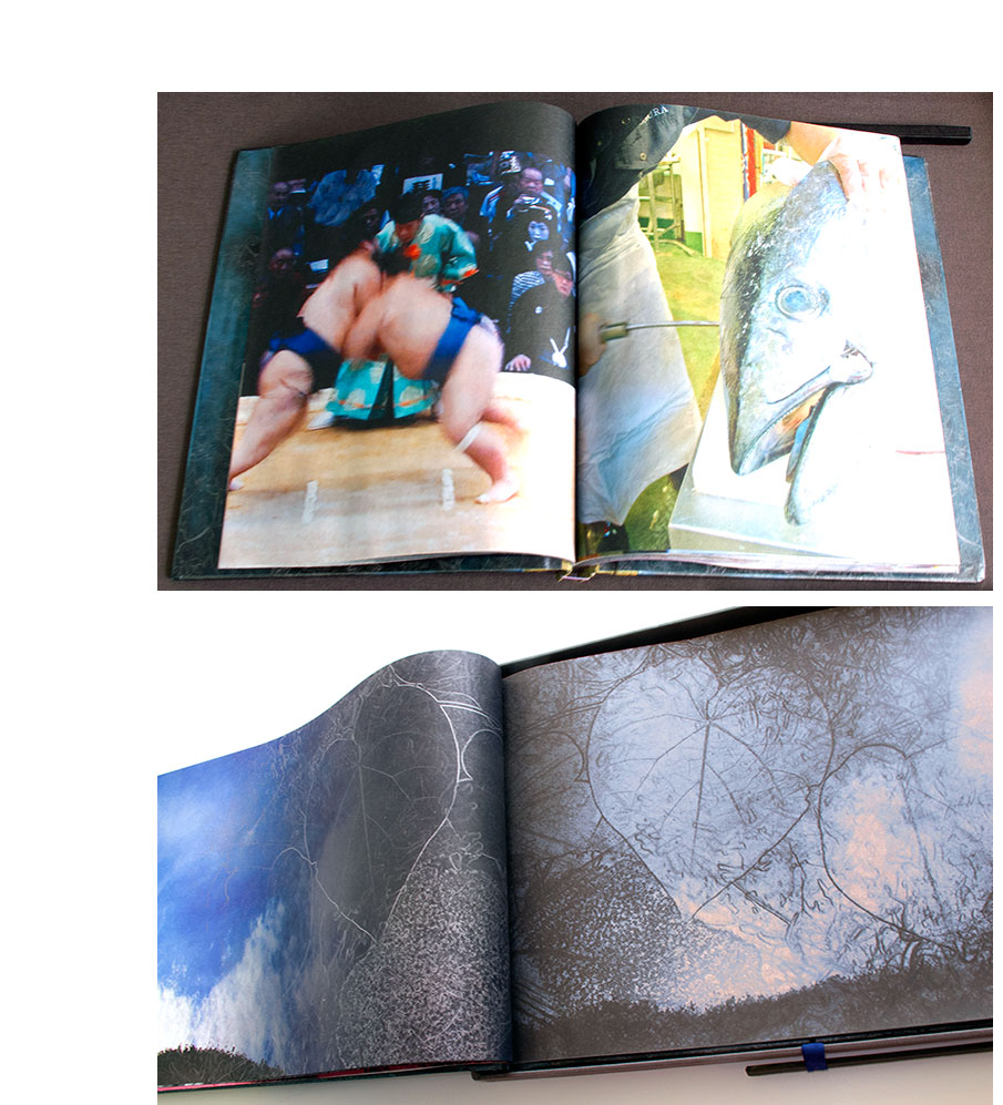
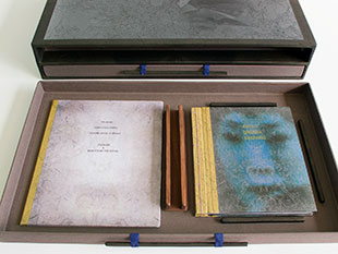
| The Japan Project By Brad Freeman Chicago: Brad Freeman, 2013/2014. Edition of 10. 21 x 12.25 x 3" box with two drawers. Top drawer houses Sumo Geisha Sashimi and Colophon & Instructions for Viewing. Bottom drawer houses Floating Bridge of Dreams. Box paper-covered with digital pattern images from Floating Bridge of Dreams. Each drawer has a wood and cloth pull for opening. Colophon & Instructions of Viewing: 9.9 x 8.25”; 4 pages including front and back boards. Paper-covered boards with cloth spine. Signed and numbered by the artist. Sumo Geisha Sashimi: 8.25 x 7.25" closed, 8.25 x 13" open; 86 pages. Cover offset printed in black, cyan, yellow, and silver/magenta. Interior pages inkjet printed on Asuka kozo papers. Bound using traditional Japanese stab binding. Floating Bridge of Dreams: 19 x 11.5”; 36 pages. Cover offset printed in black + pattern YK and metallic ink on Mohawk Superfine. Bound using Japanese stab binding. Paper-covered boards and cloth spine. Interior pages a combination of inkjet and offset print on Asuka and Mohawk Superfine papers. Ideas / Index / Colophon: "All the photographs (except two images downloaded from the Library of Congress Website, digital collages, design, prepress, printing, and binding are by me, Brad Freeman. The printing of the two books is either offset on the Heidelberg GTO with Mohawk Superfine and Astrobrite black or inkjet on the Epson 9800 with Asuka kozo paper. All printing was done at the Center for Book and Paper, Columbia College Chicago, in 2012 and 2013. The binding and box-drawer construction were completed in 2014 at my studio in Chicago. "Most of the photographs for this project were taken while on a trip to Japan in 2011 with my wife Yukie Kobayashi. A few photographs from Chicago, Portugal, and Newfoundland are included. "SUMMO GEISHA SASHIMI consists of two sequences – on each verso page a single photograph of a sumo mater is repeated over and over through all the pages while zooming in on a solitary detail – one moment of time is displayed as the view comes closer and closer to a particular detail of the larger photograph on each subsequent page. In a complementary manner, a sequence of photographs taken during a period of about twenty minutes is presented on all the recto pages. The intention was to take advantage of the book's verso-recto form and create a correspondence among the images across the gutter and through the pages that would not have been possible if each sequence was presented alone. " A visual poem, FLOATING BRIDGE OF DREAMS is a presentation of images arranged in such a way as to provide associations and enhance their meaning as the pages are turned with an ineluctable drive toward the end. The title comes from a phrase used in The Tale of Genji by Shikibu Murasaki. Three kinds of paper – Mohawk Superfine, Asuka kozo, and Astrobrite black – were used as a way to explore the possibilities of various offset and inkjet printing techniques. Also, the different weight, drape, and texture of the papers enhance the haptic quality of the viewing experience. "Playing with and making visual patterns – some created from by photographs – was given a fresh impetus in Japan and Portugal by, for instance , kimonos, decorative paper, ceramic tiles, and architectural details….The patterns in FLOTATING BRIDGE were created from my photographs – highly manipulated in Photoshop – of the garden my wife Yukie cultivates fat our home in Chicago…. "The photographs in the books here were developed into sequentially arranged associative collages – the trace of origin remains." JAB draft on sumo geisha sashimi: "The photographs that comprise the book sumo geisha sashimi were taken by me during a trip to Japan in 2011. The photograph of a televised sumo wrestling match with the audience in the background repeats on each verso page through the entire book. The image enlarges slightly with each turn of the page — we are zooming in toward a geisha in the audience. “The images on the recto are a sequence of photographs taken during a period of about thirty minutes of a man butchering (sabuku — cutting with a sharp blade) a tuna at the Tokyo fish market. This is an early step in the process of making sashimi. "The book consists of two temporal systems appearing at the same time, with one time system on the verso and one on the recto. Both temporal systems exist simultaneously on the plane of the page spread with the gutter separating the two systems. On each verso page one moment is captured in a photograph and gradually enlarges with each turn to reveal the geisha. On the recto a sequence of moments captured photographically displays the butchering of a tuna. "The codex form provides the perfect container for linking these two time systems to create an associative viewing experience. "A couple of the issues on my mind during the making of this book included a feminist critique on the position of the geisha and the ecological implications of over-fishing. I was also considering the idea of performance – the wrestling match and the butchering of the tuna are performances with an audience. The geisha in this case is in the audience — a role reversal for her since she is usually the performer — geisha means artist in Japanese and her performances include dancing, singing, and playing a musical instrument." Inquire as to pricing (Last Copy) |
|
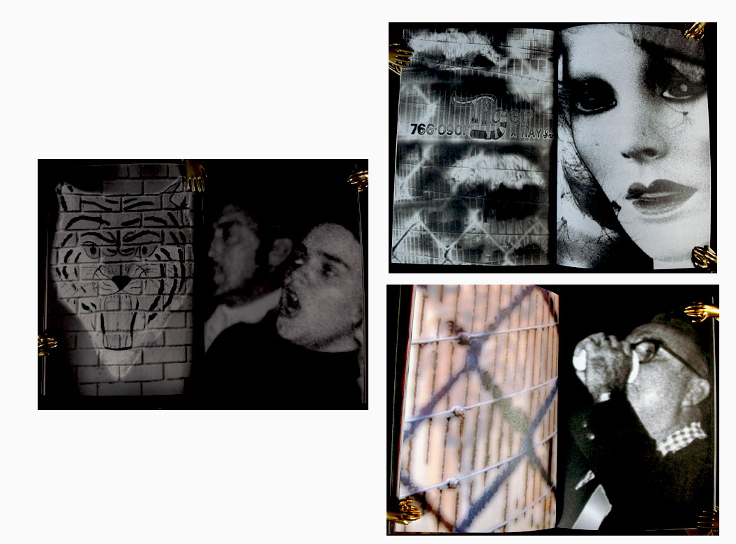
| Annotated Amusement Guide Magazine By Brad Freeman Chicago, Illinois: JAB Books, 2012. Edition of 100. 10 x 11.75"; 68 pages. Photographs, writing, design, digital collage, printing, and binding by the artist. Case bound in quarter cloth with paper covered boards. Bound to lie flat for viewing on a table. Linen tapes dyed a dark blue by the artist to complement the "cinnamon" colored book cloth. Signed and numbered o the inside back cover. Date reflects the actual binding date of that book in the edition. Brad Freeman: "This book is a visual poem about looking and creativity. On the front cover a woman on the cover of a magazine looks out at the viewer from a shop window. On the back cover three women look into a shop window. As a human we are always looking. As an artist I look, then photograph, then print, all the while changing the image of the object looked at into something new within the other pictures in a book. "Production and creativity are closely linked in my work. I intervene in all aspects of production from photography, digital and photo-mechanical prepress, and on the press. I respond to what the process can offer in terms of expressive value. "The hands (and there are many) in the book are a reference to creativity and how we combine looking with use of our hands to create. "It is about danger, beauty, surprise, death, beauty, experimental narrative, the senses (touch - how the paper feels). "It is about photography and printing. The black lines around the photo on the center spread are formed by the frame edge of the negative. In the old days (when I was a young photographer) photographers would print the frame edges to indicate that the actual framing of the picture occurred at the time the photo was taken. This is meant to show that the photograph was creating the photo from the beginning. The black linen thread works well with the frame edges. "There is a documentary aspect to the photos as well but the specific (date, name, place) are omitted and thus the photos become a larger statement about the human experience - ANNOTATED AMUSEMENT GUIDE MAGAZINE (The title is ironic, it is neither annotated or a magazine)." $300 |
|
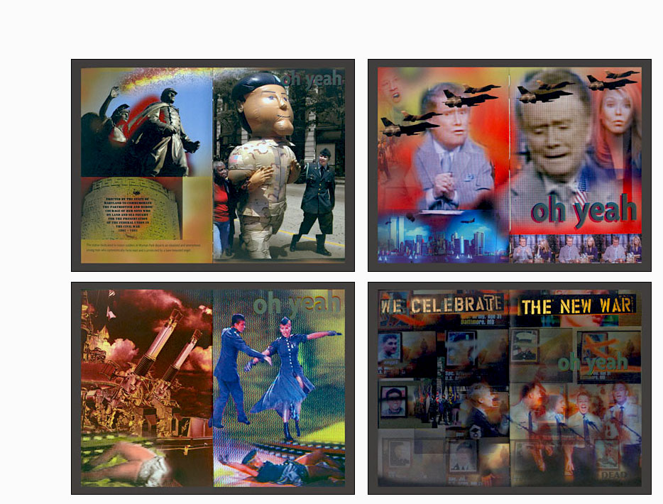
Wrong Size Fits All 6 x 9 x .75"; 134 unnumbered pages. Photographs, writing, design, digital collage, printing, and binding by the artist. Offset printed on the Heidelberg GTO onto Monadnock Dulcet 100# text paper. Printed in cmyk, duotones, quadtones, etc. Exposed seam binding with three leather straps. Printed boards. Additional information, Brad Freeman: "The whole second chapter of Wrong Size Fits All is a sardonic view of the folly of American militarism starting with the Civil War and ending with the Iraq / Afghanistan wars - and including a digital collage of Janet Jackson singing and dancing while dressed in military camouflage. The text "MISTAKING MILITARISM FOR FASHION" is written on the page." (Finalist in the 2011 MCBA Prize) |
|
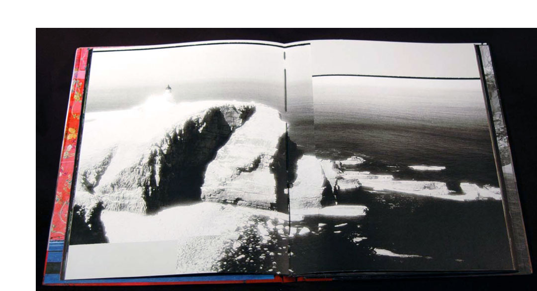
Nether Wallop 5.75 x 5.7"; 102 pages. Offset except the first four pages and colophon, which are letterpress. Offset pages printed on the Heiddelburg KORD at Nexus Press, Atlanta, in the fall 2002. Letterpress pages printed at the Center for Book & Paper Arts - Chicago. Paper: French' Dur-O-Tone Newsprint. Bound in Chicago, 2008. Conceived, designed, photographed, printed, and bound by Brad Freeman. Brad Freeman: "Conceptually the book explores the shifting areas of intersections between the public and private self, especially looking at how individual lives are entwined within larger historical narratives. The approach is more poetic, visually and textually, rather than didactic, I hope. I chose the lightest weight paper I could run in the offset press (except the end sheets which are necessarily heavy to provide a strong structure to the binding at the point of joining the text block to the cover). This light paper and modest size of the physical dimensions of the book are meant to slow the reader, to impart a sense of delicacy, a sense of fragility of life. The light paper will hopefully suggest to the reader that a slow, careful reading is called for.... "There are a combination of found photographs and photographs that I took (held the camera, composed an image from the world in front of the lens, etc.). I only clarify this a bit because of the verb 'took' - we really do 'take' a bit of the world with photography I suppose.... "The 'unfinished' covers ... I could easily have printed something but preferred for this book a reference to the making of the book, the making of the world in which we live, the process that is life ..." Additional information, Brad Freeman: "Nether Wallop is really about colonialism and war. There is a subtle (and long) visual narrative of colonialism (British in South Africa, whaling; Panama Canal; etc) and war culminating in a photograph I took in October 2001 (one month after the attacks on the twin towers) from the Empire State building looking south toward where the twin towers used to be. On the previous page is a photograph that is in MuzeLink [1997] also of the twin towers taken from the Empire State Building in the mid 1990s, a few years prior to the attack." |
|
Once Removed 17.25 x 12"; 32 pages.Offset printed. Images composed on a Mac Powerbook G4 and ibook. Font: Agenda. Photographs by both Brad Freeman and Anne George. Patterned green cloth boards with gilt stamped titling on front board. Case bound with jaconnet hinge binding. Brad Freeman: "This book is a collaboration between the artist and Anne George for the Concept to Print Residency at MCBA. The project set forth by the artists was to explore through textual/visual means the concept of artificial flowers. Emanating from this point of reference were ideas of permanence, the constructs of female beauty, ephemerality, simulacra, fashion, color, shape, and much more." MCBA: "Artists Anne George and Brad Freeman managed to fit a lot stuff in a very small package during the course of Minnesota Center for Book Arts' National Endowment for the Arts (NEA) - sponsored Concept to Print Residency. George, a Minneapolis artist, was selected from applicants nationwide to work with Freeman over an intense four-week period, using the state-of-the art production capabilities of Bolger Concept to Print. The collaboration resulted in 'Once Removed,' an engaging medley of text and image exploring the concept of artificiality. Though embodied predominantly by flowers - silk, plastic, and cut paper - the petulant metaphor is extended through layered imagery to move significant aspects of life itself. Lush colors, complex overprinting and partly occluded images suggest a disconcerting reality where even the dimensionality of the page is suspect." |
|
emerging sentience 16.375" x 11"; 33 pages. Printed paper over boards with cloth spine. Printed on Mohawk Superfine and Monadnock Astrolite (both neutral pH) with Wikoff Sunfast Ink at Nexus Press in Atlanta. Photographs, digital prepress and printing by Brad Freeman. Text by Johanna Drucker. Signed and numbered by artists. Project Statement: "Emerging Sentience was produced for the Poetry Plastique exhibition organized by Charles Bernstein and Jay Sanders at the Marianne Boesky Gallery. The conceptual foundation of the project is expressed concisely in its title: to make a work about sentience as an emergent property of intelligent systems. The original text had been written some time before, as one of the pieces in Deterring Discourse." Brad Freeman: "It is based on the following question: Is conscious self awareness an emergent function of complex systems or is it the spark of life? In other words, is there such a thing as artificial intelligence in, say, computers?" Johanna Drucker interview with Tate Shaw for JAB: "The piece, "Emerging Sentience," was part of a set of short pieces that were published as Deterring Discourse in the early 1990s. They each had new technology themes and also were responses to the closing down of public information and debate in the news around the first Gulf War. We lifted it out and condensed it slightly for this book. ... "With Emerging Sentience we took the distilled, edited text and I laid it out so it would read from a distance, on the wall, in a grid. The text is a double text, embedded—one text is visible and legible when it is on the wall but it is set into a smaller text where it reads as well. We taped up the black and white text print outs and kept reworking that design until we liked it independent of the images. Brad was shooting pictures, but he made them work within the design after the text had been structured. It was an interesting exercise for both of us to see the difference in these approaches. "As for the language—! My head just processes this way. I'm still trying to push this continual shift of register into a highly eclectic mode. The heterogeneity of contemporary language we encounter on a regular basis and the effects in terms of producing us as cultural/social/ historical subjects is something I am so aware of all the time. I always say my sensibility is created at the intersection of Mallarmé and the tabloid press. But of course, nothing is that simple. I don't use any mechanical devices—no word lists, no processing techniques or cut up—just the random access of memory and association as I write. Punning and double entendre paraphrase are like cross-links or hypertext phrases that let me step from one linguistic zone to another in a jump." |
|
The Grass is Greener 7.25 x 5"; 48 unnumbered pages. Offset printed in duotones and CMYK on Astrolite by Monadnock. Case bound with illustrated covers. Photographed, designed, and digitally manipulated by Brad Freeman. Nexus Press: "The pathos and beauty of mortal frustrations comprise the central theme of The Grass is Greener. The repetitive enclosure of the book form, with its capacity to enact a cycle of constraint within the bound sequence of its pages, reinforces the irony of this work — even as the final signature pulls back, catching its breath and ours in a dry laugh of response. This book is tight, succinct, and highly aesthetic as an expression of a wry, dark vision of the lived condition. "Finely wrought images of grass changing color, the pacing motions of a caged tiger, the expressive response of a watching crowd —- in these three signatures the theme of this book is enacted as a cycle of repetition and frustration. Highly aesthetic, its attitude doesn't reinforce a sense of futility so much as comment ironically on the lived condition. Freeman's capacity to use the book form, print medium, color, intensity, and visual range is aptly demonstrated in this succinct, tightly crafted work." The photographs were taken in Baton Rouge, Morgan City, and Tallahassee in 1999 and 1975. |
 Click image for more |
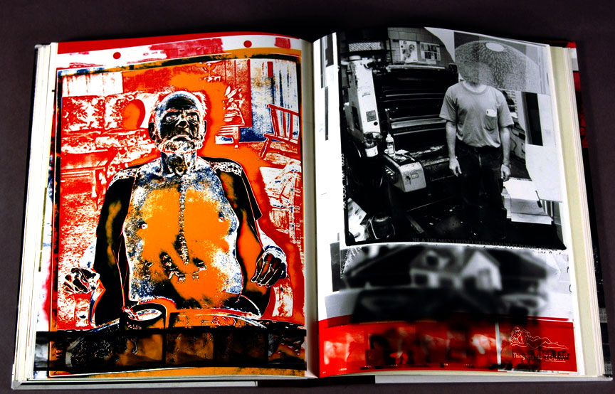
MuzeLink aka MzLK. THE TOURS. 11 x 8.5"; 168 pages; opens to 11 x 17". Traditional and alternative graphic arts darkroom pre-press as well as computer generated photo-based imagery offset printed by Brad Freeman on Warren's LOE dull coated 100 lb. text in around ten colors. Duotones, tritones and four color separations throughout. Case bound and hand sewn by the artist. Signed and numbered by Freeman on page 167. Brad Freeman: "MuzeLink is a personal / printing history starting with a playful deconstruction of the offset printing process then linking to four color reproductions of 19th century chromolithographs (the progenitor of offset lithography). These images provide a succinct view of the social values of that time and place. This is a complex book which resonates backward and forward, referencing the book as concept and historical form, and the book as an artist's medium. "In MuzeLink a textual / visual narrative traces the path of the European take over of North America (slaughter of the native Indians, slavery of Africans) with reproductions of 19th century chromolithographs. This section segues into photographs I took of a Ku Klux Klan rally in Tallahassee in 1976. Later in the book is a section titled Architecture and Military Museums that has a blatantly anti-war theme including the story of Yasotay, a general in Genghis Khan's army who welcomed death in battle." Nancy Princenthal, On Paper Nov. - Dec. 1997: "... There is nothing schematic about this book. Presented in unique covers collaged from set-up sheets titled in silver, and bound in Asahi silk, Freeman's visual feast can be sampled as freely as any hot-linked hypertext. It is served, however, with the composure of someone who knows his story will satisfy even those who read it from front to back." |
 Click image for more |
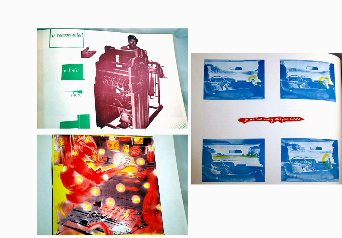
| Joe By Brad Freeman [Tallahassee, Florida]: Brad Freeman, 1984. Edition of 240. 10.875 x 8.25"; 70 pages. Multi color ("at least" 10 colors) offset printing including duotones, posterizations, substractive over-printing, and split fountains. Saddle stitch binding with illustrated front cover. Signed and numbered by Freeman. Brad Freeman: "Photo/text documentary about Joe Ruther - printer, book artist, photographer, teacher, and redneck philosopher from Tallahassee, Florida. Most of the text is taped conversation between Ruther & Freeman." Joe Ruther was Freeman's mentor. "[Joe] was printed on a press purchased from him. The style of printing was largely influenced by him too. My roots, using offset as a creative printmaking medium in artist's books." Note from copyright page: "Original photo offset prints and transcriptions of taped conversations between Joe Ruther and the artist. The editing hasn't sanitized the conversations, rather it was meant to speed up the reading. Of course there are exceptions." One of the printing purposes stated was "to explore the potential of offset as a creative printmaking medium." This book was chosen as the offset book of 1984 in the exhibition “Offset Artists’ Books”, Art of the Book Room, Sterling Library, Yale University, New Haven. $30 |
 Click image for more |
| Brad Freeman Out of Print Title: |
|
Murder of Crows 5.6 x 6.7"; 16 pages (unpaginated). Offset printed in five colors on Mohawk Superfine. Softcover with sewn binding. Text and drawings by Brad Freeman. A haunting dream sequence of alienation and loss. Etiolated drawings reflect absence of spirit. An exaltation of larks is supplanted by a murder of crows. No saving surrealistic humor here. It's the bleakest form of adolescent pit – except it gave us this book, a victory of sorts for art. |
 Click image for more |
Nova Reperta 16.625 x 10.125" (closed); 66 pages. Photographs and offset lithography (digital and photomechanical prepress) by Brad Freeman. Text by Johanna Drucker. Paper Mohawk Superfine. Hardbound with brass posts in boards and silk. With a stand of varnished red oak that serves as a base. Signed and numbered. Brad Freeman: "Nova Reperta is a contemporary response to a book of engravings made from drawings by the Dutch artist Jan van der Straet (Johannes Stradanus) in which he celebrated those innovations that had shaped the modern world in the latter half of the 16th century. Produced in an era of rapid-seeming development and considerable global exploration, the spirit of Stradanus's work reflected an unqualified embrace of progress. Celebrating change wrought by various mechanical and technical inventions, including the reproduction through copper engraving that fostered the printing of images, his drawings documented many specific discoveries in pictorial formats. “The authors' response is conceived as a dialogue with rather than an imitation of the original work. It makes no attempt to mimic Stradanus's pictorial strategies, nor to be consistent with his celebratory spirit. Rather, it is a critical reflection upon the extension of that world view of progress from a perspective possible more than four centuries later.” |
|
SIMWAR 6.5 x 6"; 30 pages. Softcover. Offset printed in duotones on Lustro dull. Stapled binding. Freeman recounts how his idea of the Vietnam War (could be any war, couldn't it?) shifts from heroic idealism to grimmer reality. Brad Freeman: "Television and video game images of simulated and real war raise questions as to how these technologies separate people from the tragic consequences of war. A parallel autobiographical text relates the author's adolescent experience in a hospital with men wounded in war." |
 |
Page last update: 03.08.2024
Home | About Us | Contact Us | New Arrivals | Fine Press & Artists' Books | Broadsides |Resource Books | Order/Inquiry
Copyright © 2021 Vamp & Tramp, Booksellers, LLC. All rights reserved.