
Share this page: |
|
| Springtide Press: " Located in Tacoma, Washington, Springtide Press includes a large collection of vintage foundry type, printing presses, a perforator as well as bindery equipment, most of which is well over 100 years old." | |
Food broadsides |
|
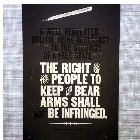
| Amend By Jessica Spring Tacoma, Washington: Springtide Press, 2015. Edition of 40. 12.5 x 19" single sheet. Broadside letterpress printed on French Paper Muscletone utilizing wood and metal type and a vintage copper engraving of an ink pen. Each print is amended in pencil, numbered, and signed by the artist. Jessica Spring: "It seems we barely have time to grieve and another mass shooting is announced. While politicians respond with 'thoughts and prayers' and continued debate over gun control, nothing seems to change. There are simply too many guns in our country, many designed for military use so powerful they massacre innocent victims in seconds. The Second Amendment, written in 1791, is constantly used to defend the rights of gun owners. Amend is my attempt to rewrite the Second Amendment, honoring our collective right to be free of gun violence. "A portion of each sale will be donated to the Coalition to Stop Gun Violence." $30 |
 Click image to enlarge |
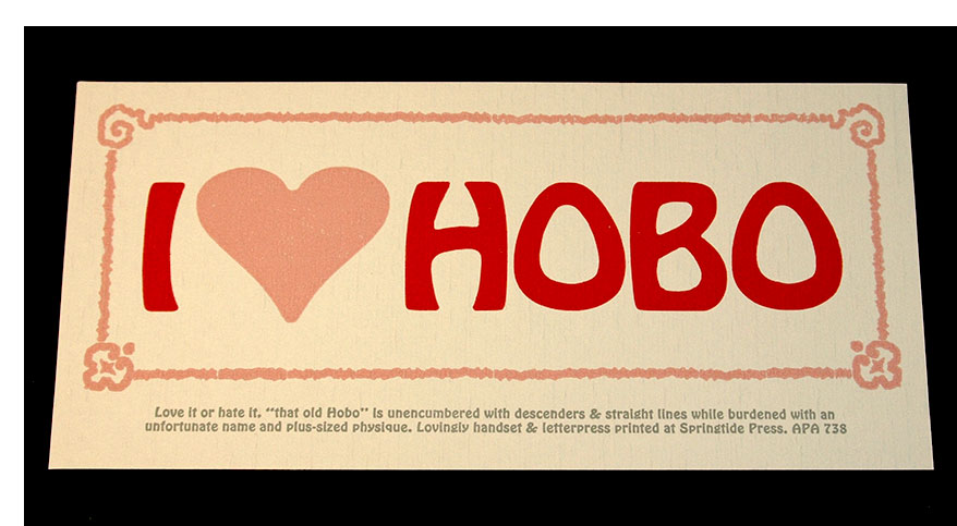
| I love Hobo By Jessica Spring Tacoma, Washington: Springtide Press, 2015. 8.5 x 4" single sheet, small broadside. Letterpress printed with handset Hobo type. Wikipedia: "Hobo is a sans serif typeface. It is unique in having virtually no straight lines and no descenders. It was created by Morris Fuller Benton and issued by American Type Founders in 1910. A light version, Light Hobo, was released in 1915. Matrices were offered for mechanical composition by Intertype. Hobo possesses uniquely organic and art nouveau-style features. "Its name came from a story stating that it was sketched in the early 1900s, sent to the foundry nameless, and progressed so little for so long, that it was called "that old hobo." Colophon: "Love it or hate it, 'that old' Hobo' is unencumbered with descenders & straight lines while burdened with an unfortunate name and plus sized physique." $10 |
 Click image to enlarge |
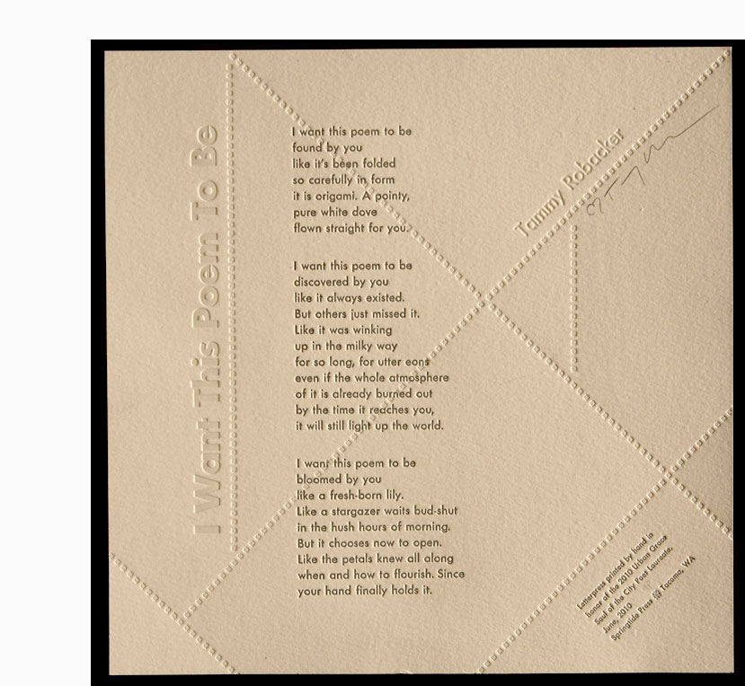
I Want This Poem to Be 12 x 12" single sheet broadside. Letterpress printed by hand. Printed in honor of the 2010 Urban Grace Soul of the City Poet Laureate. The first in a series of a Poet Laureate Commemorative Broadside series in Tacoma, Washington. TLR Words & Works (the poet's blog), June 21, 2010: "Letterpress artist, Jessica Spring and poet, Tammy Robacker will be rolling out Tacoma's first Poet Laureate Commemorative Broadside series. Both artists partnered this spring to create the first ever letterpress poetry poster celebrating the Soul of the City Poet Laureate program in Tacoma. Robacker is hoping a tradition has been started to honor the poets and the growing legacy of the poet laureate program by having an annual letterpress broadside created for each new poet who wins the contest. The broadside posters of Robacker's poetry are coupled with Spring's acclaimed letterpress artwork. The posters are limited edition and collectible. They will be signed and sold at the event. Proceeds from the sale of the broadsides will go to support the Urban Grace Poet Laureate program and the artists who created them."
$25 (Last Copy) |
 Click image for more |
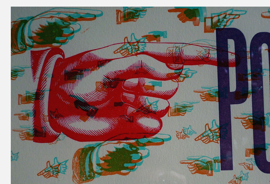
Polite Pointers 7.5 x 14.75" broadside letterpress printed in 5 colors. Works with 3-D glasses (not supplied). Text: "Gently tilt the head in the direction of indication, raising the eyebrows for helpful emphasis"; "Use a subtle finger rounding the nose in the direction of indication, as if to relieve an itch"; "Shield the wielded pointer behind a newspaper or your opposing palm in the direction of indication."
|
 Click image for more |
| Mottos and other sayings | |
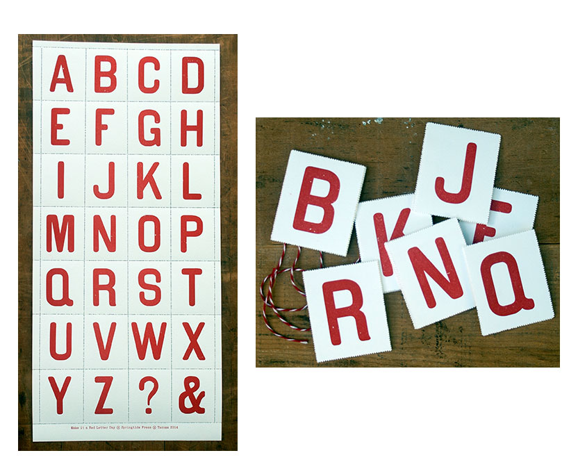
| Make it a Red Letter Day By Jessica Spring Tacoma, Washington: Springtide Press, 2014. Edition unstated. 21 x 10" single sheet. Broadside. Letterpress printed. The 26 letters of the alphabet plus a Question Mark (?) and Ampersand (&) aligned in 4 columns and 7 rows. Each letter/symbol printed in red on a perforated rectangle (2.25 x 3"). One in a series of broadsides based on mottoes or common phrases created by Jessica Spring. "Red Letter Day" is used to describe a special day, a day on which something special has happened or will happen. Red & white twine accompanies each broadside. The letters can be perforated, given out, displayed individually or kept in a 'bundle' with the thread to tie them together. $30 |
|
Hustle
$20 cream paper |
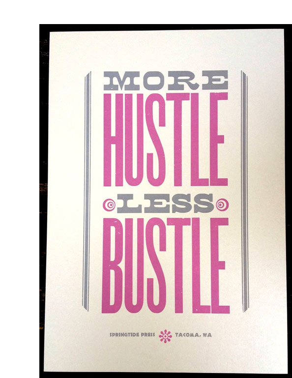 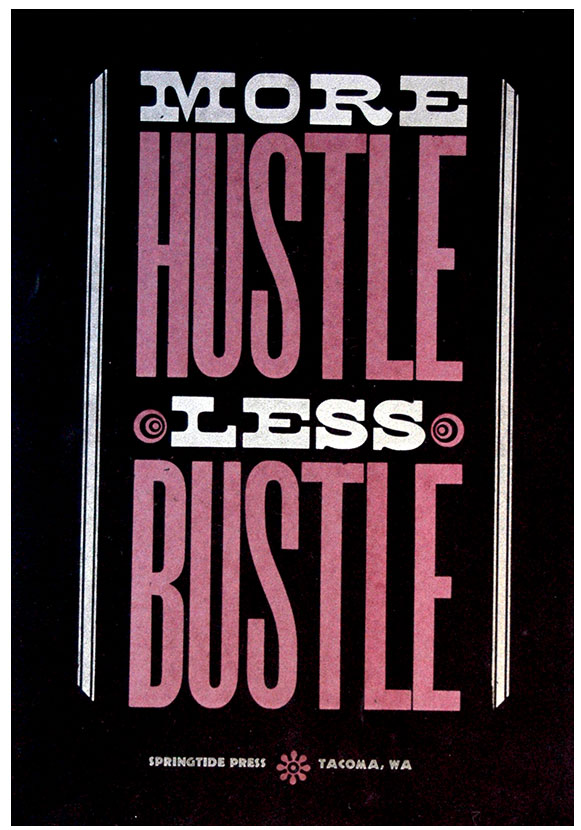 Cream paper Black velvet paper Click image to enlarge |
More Wine!
$ 15 |
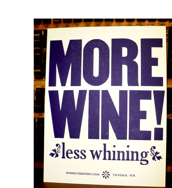 Click image to enlarge |
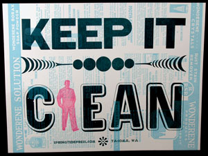
Keep it Clean 12.9 x 9.9"; single sheet (broadside). Letterpress printed. Jessica Spring: "I've been printing my mottos – that was one inspired by two huge vintage plates a friend found at a junk shop. No limit, I probably printed 30 or so. I like to add some ephemera into the work flow with the editioned work. A lot of buyers are putting them in the bathroom or laundry room – mine is in the shop of course!" |
 |
| Jessica Spring: "Both spice and type have incredibly rich histories as valuable commodities traded across continents, spreading religion, culture, and knowledge. Both serve as agents of preservation and enhancement: well applied use of spice or type completely alters the experience of consumption. Spiceography is a set of broadsides. The Deluxe boxed set with map is sold out. Single broadsides are available. [An edition of 15 was printed for each broadside of which 7 were designated for the Deluxe boxed set.] "Each Spiceography broadside is printed on handmade paper containing its featured spice and utilizes multiple letterpress techniques: photopolymer, handset foundry and wood type, vintage ornaments, wire printing, monoprinting, linoleum, and collage." |
|
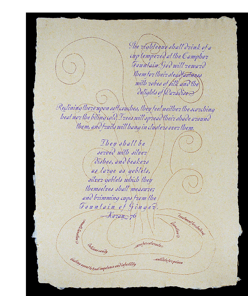
| Ginger By Jessica Spring Tacoma, Washington: Springtide Press, 2002. Edition of 15. 15.125 x 20", single sheet broadside. Printed letterpress in Escrita on handmade paper. Jessica Spring: "Ginger was brought by Arabs to the Greeks and Romans, who believed it grew in the land of the Troglodytes - people who lived on the edge of the earth. Marco Polo recorded cultivated ginger throughout China. The Portuguese grew ginger in West Africa and fed it to men in slave gangs, hoping the aphrodisiac would boost population and productivity. "One of the oldest spices, ginger is mentioned in the Talmud and the Bible. The Koran celebrates ginger as one of the two aromatics of the next world. Muhammad grew up in the great trading city of Mecca, part of a merchant family. He married the daughter of a spice trader and recognized the mutual benefits of spreading spices and Islam. "Escrita (writing in Portuguese) was designed by Mario Feliciano for T26, a Chicago-based digital type foundry. According to Feliciano, Escrita 'was designed as an attempt to reproduce a sense of Portuguese writing. It is based on the work of 18th-century Portuguese calligrapher Manoel Andrade de Figueiredo.' Escrita includes flowing initial and finial alternate characters that serve to emphasize the handwritten feel." $100 (Last Copy) |
 Click image to enlarge |
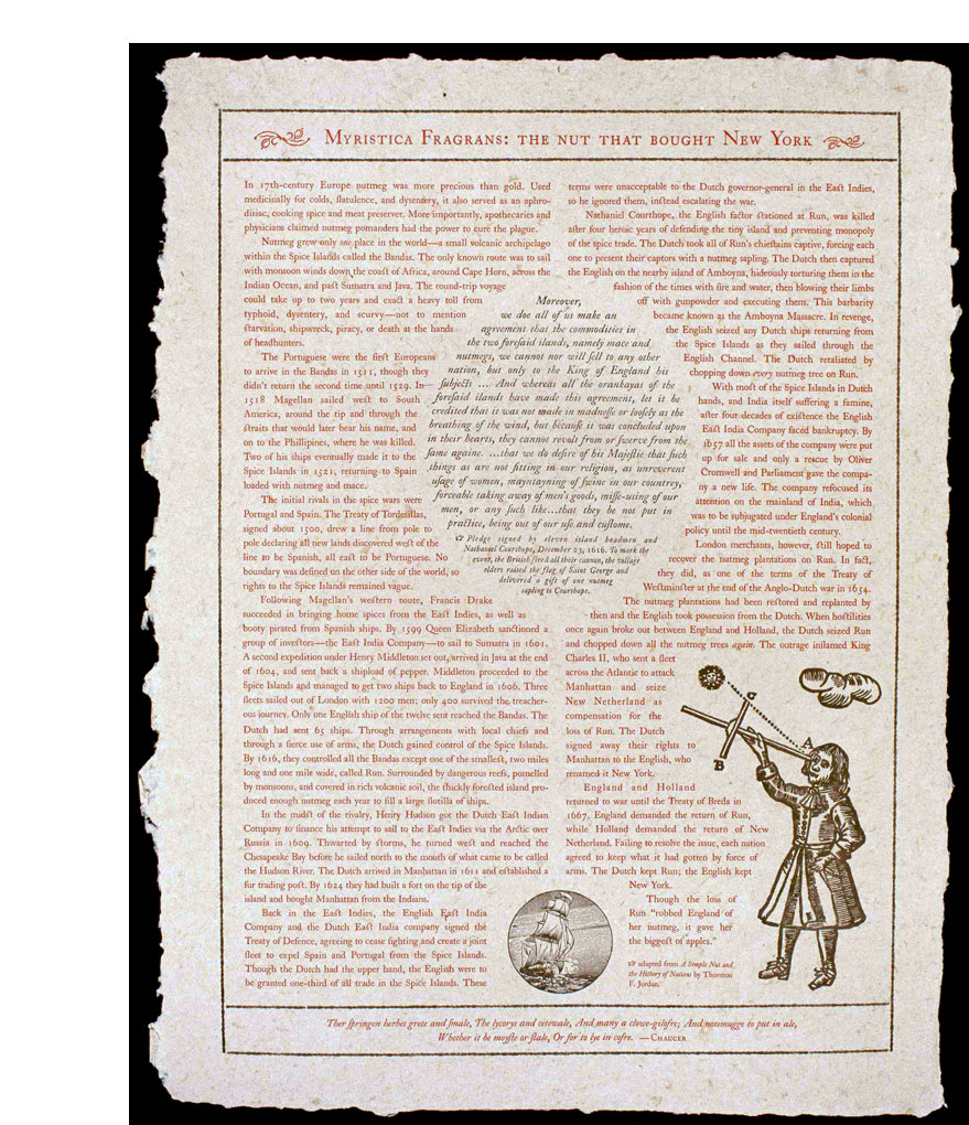
| Myrista Fragrans: The Nut that Bought New York By Jessica Spring Tacoma, Washington: Springtide Press, 2002. Edition of 15. 15.125 x 20" Single sheet broadside. Printed letterpress on handmade paper using Caslon typeface. This broadside recounts the convoluted tale of how nutmeg, more precious than gold in 17th-century Europe, played a major role in England's prominence in the New World. Jessica Spring: "The nutmeg tree produces fruit which can be boiled for jam. Inside is a core or 'nut' covered with a crimson, lacy covering called an aril. This is removed from the nut and dried in the sun to produce mace, which has a light, delicate flavor. The core inside is also dried, then cracked open to extract the nutmeg, which is best used when freshly grated. "Dutch traders used a lime solution to sterilize nuts before export to protect their monopoly. Transportation was further complicated by the trees' gender: male and female varieties are difficult to identify and at least one male tree is required for every seven females to produce fruit. Nutmeg was believed to provide magic powers, especially in the art of seduction. "Born in 1692 in England, William Caslon apprenticed to an engraver of guns, eventually opening his own shop to cut type for bindings and binders' tools. The majority of English printers used type from Dutch foundries until Caslon's production in 1722 of a roman, italic, and Hebrew font. His famous specimen of Caslon produced in 1734 eventually spread their use 'internationally, most notably to print the Declaration of Independence." $100 (Last Copy) |
 Click image to enlarge |
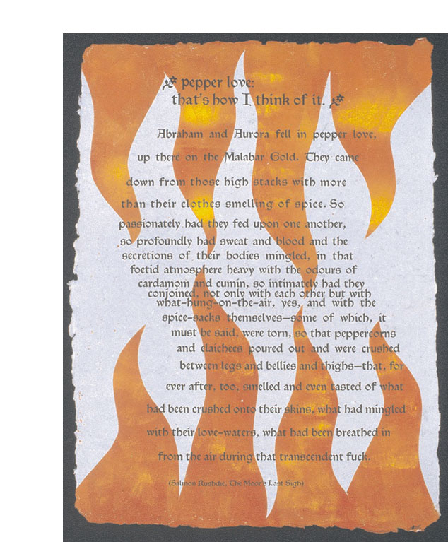
| pepper love: that's how I think of it By Jessica Spring Tacoma, Washington: Springtide Press, 2002. Edition of 15. 15.125 x 20" single sheet broadside, part of the Spiceography series. Printed letterpress using handset Satanick typeface for the headline and Troy for the body. Printed from photopolymer plates onto handmade paper with pepper in the mix. Satanick is based on the Troy and Chaucer types designed by William Morris for his Kelmscott Press. Jessica Spring's homage to pepper features an excerpt from Salmon Rushdie's The Moor's Last Sigh: "Abraham and Aurora fell in pepper love…." $100 |
 Click image to enlarge |
| Today, broadside printing is done by many smaller printers and publishers as a fine art variant, with poems often being available as broadsides, intended to be framed and hung on the wall - to be just enjoyed. | |
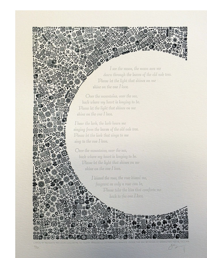
I See the Moon (as sung by the Mariners)
$80 |
 Click image to enlarge |
| Using food metaphors Jessica Spring addresses a whole range of topics and emotions. | |
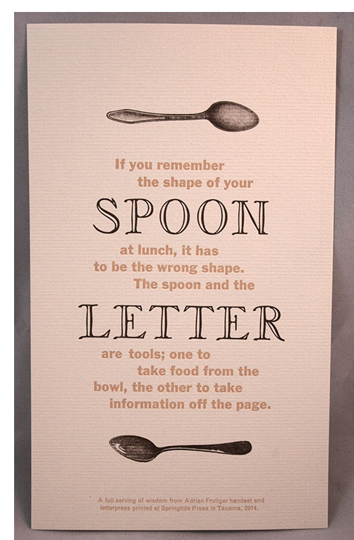
| Spoon Letter Quote by Adrian Frutiger Printed by Jessica Spring Tacoma, Washington: Springtide Press, 2014. Edition unstated. 69 x 10"; single sheet. Broadside. Letterpress printed on cream paper. A letterpress printed broadside with a quote from typeface designer, Adrian Frutiger: "If you remember the shape of your spoon at lunch, it has to be the wrong shape. The spoon and the letter are tools; one to take from the bowl, the other to take information off the page." $15 |
 Click image to enlarge |
Cherry Pie 13 x 13"; single sheet. Handset and letterpress printed in two colors by Jessica Spring & Mary-Alice Pomputius at Springtide Press. Printed on textured Fabriano Murillo paper. Signed by both artists and numbered. Jessica Wood: "One of a twin series of prints inspired by wise words from characters in Twin Peaks, made in collaboration with Grundoon Press. A quote from the Log Lady is handset and letterpress printed with some damn good wood type and miraculous 60 point Hobo. Carefully handset and curved, the text and ornaments resemble a slice of pie, complete with hand-formed crust." The Log Lady is a character from the television series Twin Peaks which ran during 1990–1991. The Log Lady carried around a small log which she used to dispense gossip and philosophical tidbits. |
 Click image for more |
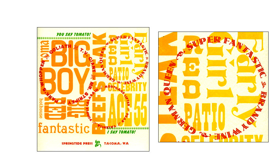
| You say tomato! I say tomato! By Jessica Spring Tacoma, Washington: Springtide Press, 2012. Open Edition. 9 x 9.5" broadside. Letterpress printed on Fabriano Murillo paper. Jessica Spring: "Wood type arranged and printed as a rainbow roll is overprinted with handset type in circles, all singing the praises of heirloom tomatoes. Bold green type contrasts the oranges, reds and yellows reading 'You Say Tomato! I Say Tomato!'" $20 |
 Click image for more |
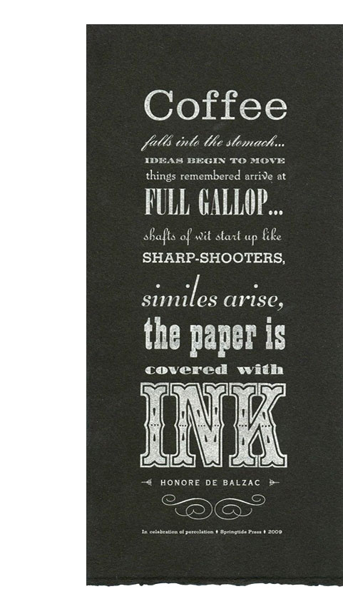
| Percolation By Honoré de Balzac Tacoma, Washington: Springtide Press, 2009. Open Edition. 4.75 x 11.25" single-sheet broadside. Letterpress printed with handset type on Somerset Velvet. Jessica Spring: "Letterpress printed broadside is a celebration of coffee and ink with Honoré de Balzac's quote printed in handset type. Thirteen different vintage metal and wood fonts are printed in silver ink." Quote: "Coffee falls into the stomach...ideas begin to move things remembered arrive at full gallop...shafts of wit start up like sharp-shooters, similes arise, the paper is covered with ink." $15 |
 Click image to enlarge |
| SOLD and Out of Print broadsides by Springtide Press: | |
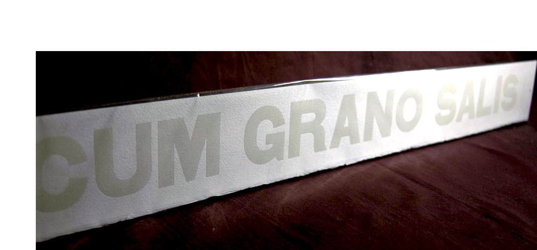
Cum Grano Salis 30 x 3.5" single oblong sheet. Broadside using handset wood type. Printed letterpress with cream lettering on cream paper. One in Springtide's broadside series of mottos. Jessica Spring: "This Latin phrase translates with a grain of salt or with a grain of wit, encouraging a healthy dose of skepticism. Often traced to Pliny the Elder's Naturalis Historia, it refers to an antidote for poison. The recipe included a grain of salt, perhaps to ease in consumption. This motto will serve you well in life and the kitchen." |
 Click image to enlarge |
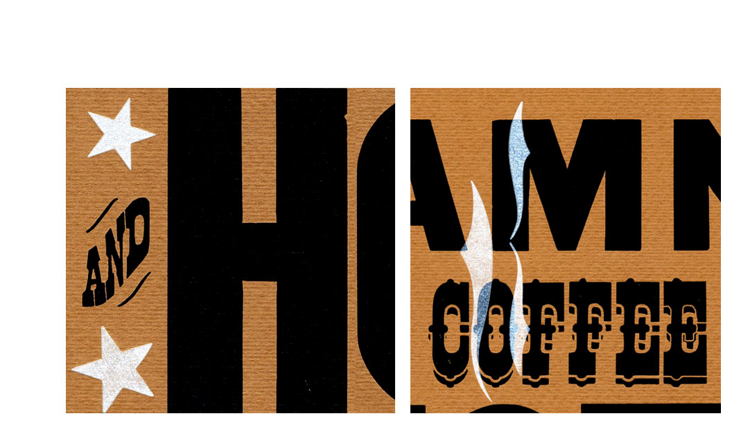
| Damn Good Coffee By Jessica Spring and Mary Alice Pomputius Tacoma, Washington: Springtide Press, 2013. Edition of 90. 13 x 13"; single sheet. Handset and letterpress printed in two colors by Jessica Spring & Mary-Alice Pomputius at Springtide Press. Printed on brown textured Fabriano Murillo paper. Signed by both artists and numbered. Colophon: "Agent Dale Cooper, who drank it black as midnight on a moonless night." Jessica Spring: "One of a twin series of prints inspired by wise words from characters in Twin Peaks, made in collaboration with Grundoon Press. A quote from Agent Dale Cooper is handset and letterpress printed with some damn good wood type, border & stars. Carefully handset, the wood type is overprinted with translucent white steam." Agent Dale Cooper was the protagonist in the television series Twin Peaks. He is an eccentric FBI agent in Twin Peaks to investigate the murder of a teenage girl. He has some quirky mannerisms and a sense of humor. He loves a good cherry pie along with a "damn fine cup of coffee." (SOLD) |
 Click image for more |
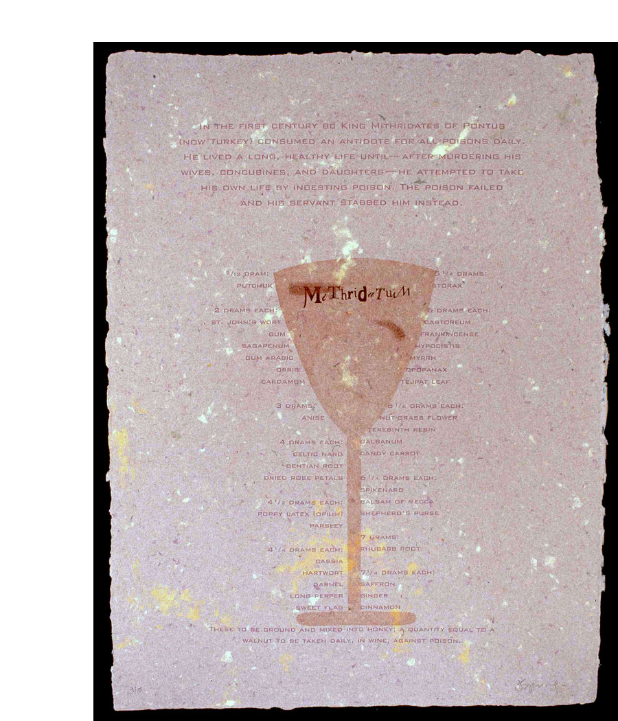
| Mithridatum By Jessica Spring Tacoma, Washington: Springtide Press, 2002. Edition of 15. 15.125 x 20" single sheet broadside. Printed letterpress using Bank Gothic typeface on paper handmade from pulp from the remains of all of the other broadsides in this series. Jessica Spring: "Mithradates the Great was the sixth, and last, Pontic ruler by that name. Mithradates means 'gift of the god Mithra,' (Persian for Apollo.) When Mithradates succeeded his father, Mithradates Eurgetes, in 120 BC, he was then only a boy, and for a few years his mother ruled in his place. About 115 BC, she was deposed and thrown into prison by her son, who then ruled alone. Mithradates used prisoners to test various antidotes for poisons in order to invent a universal antidote which could neutralize any poison. Only a king could afford to take a daily does of MITHRIDATIUM with 36 ingredients that included the most rare and expensive spices. "Bank Gothic was designed by Morris Fuller Benton for ATF in 1930. Intended as a contemporary variation of Copperplate - also a lining gothic - it was also popular with job printers for stationery and forms. The name probably comes from its appropriateness for printing required by the banking industry. "Benton was the son of Linn Boyd Benton, inventor in 1884 of the punchcutting machine which mechanized the cutting of fonts from patterns in multiple sizes. Father and son spent most of their working lives at ATF making crucial contributions to the development of typefounding in the United States. Morris produced revivals of classic faces and designed many new fonts that have survived in digital form today." The recipe for a poison antidote such as Mithradates might have consumed is printed (in Bank Gothic) along with the instructions: "These to be ground and mixed into honey; a quantity equal to a walnut to be taken daily, in wine, against poison." (SOLD) |
 Click image to enlarge |
The Orchard 14 x 17.5", single sheet. Letterpress printed on Japanese paper in Legend font. This broadside printed by Jessica Spring was a result of the Al-Mutannabi Street Broadside Project. The project was "A Call to Action for Letterpress Printers! To protest & commemorate the bombing of al-Mutanabbi Street, the centre of bookselling in Baghdad, on March 5th 2007." Jessica Spring: "The Orchard by Saadi Yousef suggested a beautiful, ephemeral place to me. For this piece I chose some impossibly delicate Japanese paper, probably not intended to print on but rather to wrap up ceramics or something more utilitarian. Combined with an Art Nouveau wood border, the color, fragility and occasional papermaker's tears seemed just right for the poem. For the type I used Legend for its calligraphic feel, though I wrestled over the choice – the font is seen so much on everything even remotely Arab, especially menus. That's part of how I read the poem though, as a memorial to a place we have changed immeasurably." |
 |
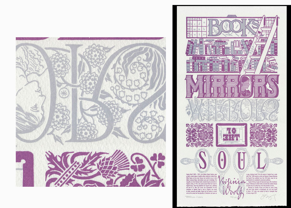
| Paper Chase By Jessica Spring and Chandler O'Leary Tacoma, Washington: Springtide Press, 2011. Edition of 129. 9.75 x 18"; single-sheet broadside. Printed letterpress with gray and purple lettering on archival 100% rag (cotton) paper. Handset wood type. Signed and numbered by the artists. Springtide Press: "This hand-pulled letterpress print is printed from hand-lettered original typography and hand-drawn illustrations and patterns (in fact, everything was done by hand, the hard way!). This piece is a collaboration between Chandler O'Leary of Anagram Press and Jessica Spring of Springtide Press, in honor of the tactile power of fresh ink and crisp pages. "Here in Washington we're known for the kind of chilly weather that demands a cozy sweater, a cup of tea and time spent curled up with a good book. The news of bankrupt corporate bookstores and dire warnings of an electronic apocalypse swirl around us as we read. Yet the world contained between a pair of unassuming cloth covers begs to differ-and we breathe a contented sigh at the simple truth that books are here to stay. "Paper Chase is teeming with the tools of Virginia Woolf's trade. A type case helps sort the problem of minding one's Ps and Qs, while an inked-up chase is locked and loaded and ready to print. Above that is a staple of any writer: a messy bookshelf overflowing with stacked volumes. Reflected in the mirror of Virginia's work is the beauty-and sadness-that veils her prose. Ghostly silver ink floats like a lingering afterimage, and an ethereal garden blooms from spectral soil. Lilacs and lilies, thistles and honeysuckles take root—each plants a seed of meaning from the Victorian tome The Language of Flowers. Do a little digging and discover layers of rich symbolism that reveal the woman behind the words. "The poster was printed on an antique Vandercook Universal One press. Each piece is printed on archival, 100% rag (cotton) paper, and individually signed and numbered by both artists. (SOLD) |
|
| Printer's Tears By Jessica Spring Tacoma, Washington: Springtide Press, 2015. Edition of 100. 11 x 18" single sheet. Broadside letterpress printed on soft white Arches paper. Signed by the artist. Jessica Spring: "During a residency at the International Printing Museum in Los Angeles, I had the opportunity to work with type from the David M. Norton Collection, full of 19th-century typographic gems. My visit overlapped with a relentless heatwave and several rain showers. Being from rainy Washington state, it seemed like the ideal inspiration when I discovered what appeared to be rain—or tears—intended for border material. Labeled Unique Border 215, the drips came in corner pieces, single drips, and, the ones I used, in triplicate. Some stunning 48-line wood type numerals made fine clouds, and the next pass, inspired by an English nursery rhyme, was set with Ionic Comp. and Antique Extended. I utilized concentric rings to set Livermore; Gothic Ornate No. 2 and Satanick in the clouds. The sixth and last pass of the edition was set in tiny, delicate Geometric Italic which also includes an “and” catchword—definitely the smallest I have ever seen. "Proceeds from half the edition go directly to the International Printing Museum to support their efforts in educational outreach and preservation of the tools and traditions of letterpress printing." (SOLD) |
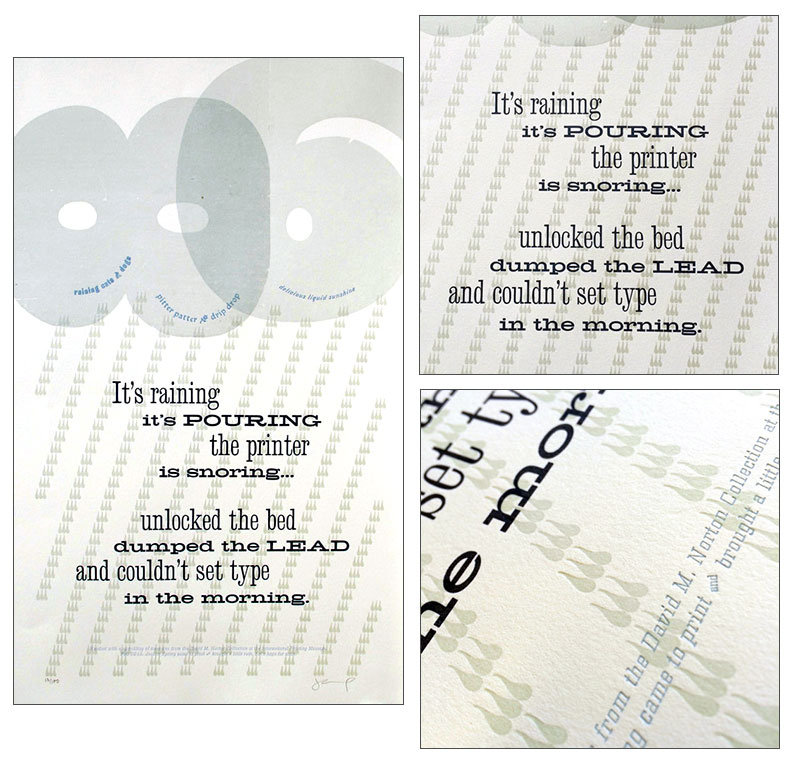 Click image for more |
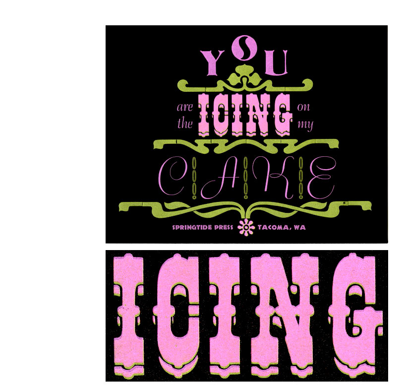
| you are the icing on my cake By Jessica Spring Tacoma, Washington: Springtide Press, 2012. Unnumbered edition. 8.5 x 11" broadside. Letterpress printed using fluorescent inks. Two versions: printed on brown sparkly paper or printed on handmade paper. Jessica Spring: "Fluorescent inks really take the cake on this print that incorporates art nouveau wood border, wood type, and huge metal type letterpress printed on chocolate brown, sparkly paper." (SOLD) |
 Click image for more |
| Verse of Light Text from Malala Yousafazai Broadside by Jessica Spring Tacoma, Washington: Springtide Press, 2015. Edition of 30. 12 x 22" single sheet. Broadside. Letterpress printed on cream-colored handmade Japanese Kozo paper. Deckled edge at the bottom. Numbered and signed by the artist. Jessica Spring: "Several years ago I had composed a carpet of ornaments intended for another project, and they set on a large galley unused—for some reason I just couldn't tackle the project. Following the terrorist attacks in Paris this November I was inspired to respond. Arranging and rearranging the ornaments, meditating on color, focusing on registration and craft all felt right, something I could accomplish. Malala's words also felt right, honoring so many lives lost in the City of Light. I set her text in a combination of 120 point Huxley Vertical with Bernhard Tango, a choice which also felt right with the Art Nouveau border and surrounding ornaments. "A portion of each sale will be donated to the Malala Fund 'to enable girls to complete 12 years of safe, quality education so that they can achieve their potential and be positive change-makers in their families and communities.." (SOLD) |
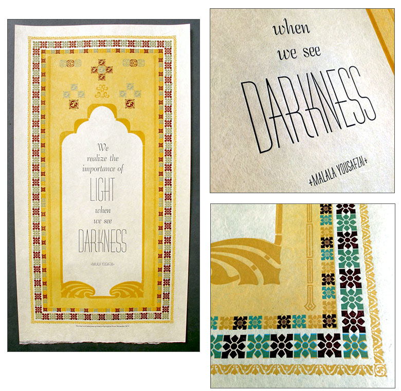 Click image for more |
Page last update: 02.10.2025
Home | About Us | Contact Us | New Arrivals | Fine Press & Artists' Books | Broadsides |Resource Books | Order/Inquiry
Copyright © 2023 Vamp & Tramp, Booksellers, LLC. All rights reserved.